Toast’s Digital Storefront Suite brings Websites, Online Ordering, and a branded mobile app into one cohesive, POS‑aware platform. We unified guest‑facing and customer‑facing experiences under a single brand system and editor so operators can design once, reuse everywhere, and publish fast with confidence, all tightly integrated with Toast.
My Role & Team
I was the Lead Product Designer (founding), partnering across research, product, and engineering. I owned the end‑to‑end experience strategy and design for guest‑facing (Websites, Online Ordering, branded app) and customer‑facing (editor/admin) surfaces. Responsibilities included:
→ Defining the experience vision, UX strategy and design roadmap for the suite.
→ Research and customer interviews with multi‑location operators and independents.
→ Information architecture, editing model, component library, and interaction patterns.
→Cross‑functional collaboration with PMs/engineering to sequence scope for a <4‑month launch.
The Challenge:
Restaurants were juggling multiple tools to run the same brand. That meant:
→Extra work: the same info (menu, hours, promos, photos) re‑entered in different places.
→Brand drift: colors, logos, and layouts didn’t match across web, ordering, and the app.
→Slow, risky updates: teams guessed how changes would look, and mistakes made it to guests.
→Hard to scale: opening a new location or channel multiplied the busywork.
We needed one editor and one source of truth so operators could make a change once and trust it everywhere.
The Goals
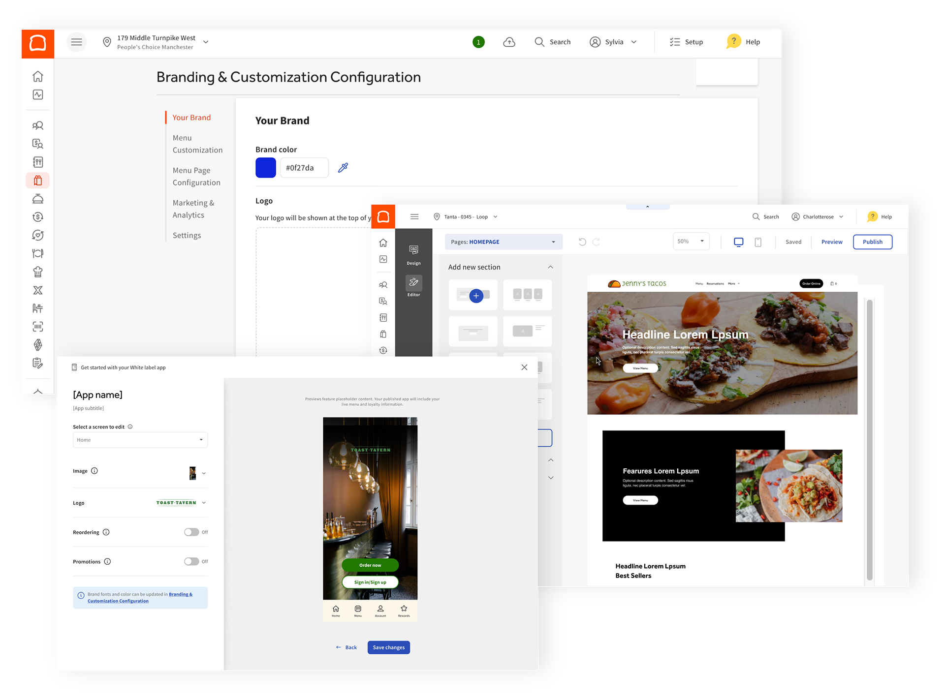
Look like yourself everywhere. Guests should recognize your brand on every surface.
Change once, done. Updates flow across web, ordering, and the app.
Hit publish without fear. See it live as you edit; checks prevent broken experiences.
Build quickly. Simple building blocks help non‑technical staff move fast.

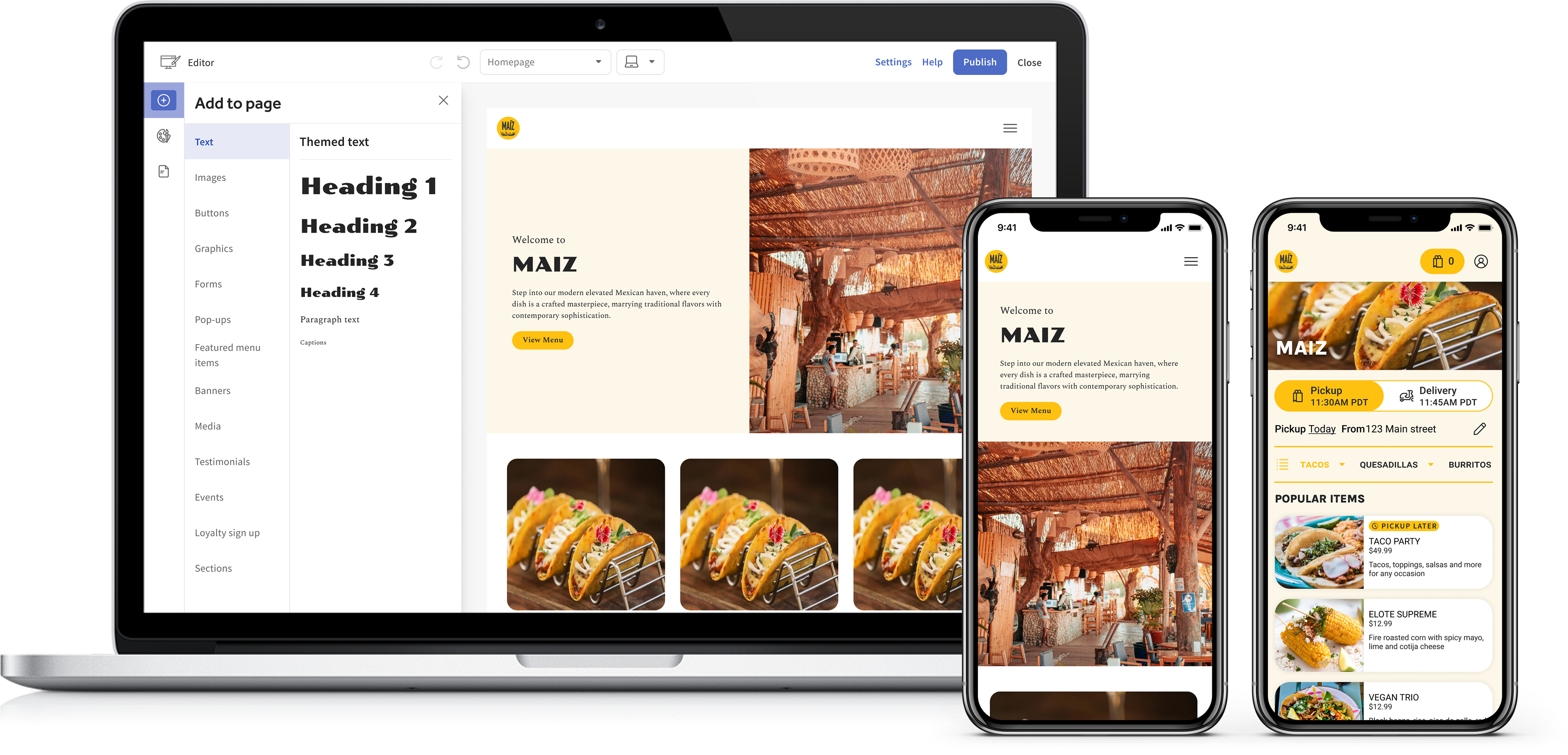
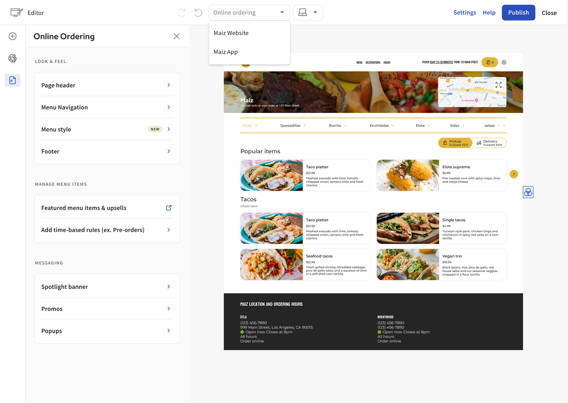
The Website Builder
To make storefronts feel like one brand everywhere, we started with the surface guests see first: Websites. Operators told us two things: “let me see what guests will see” and “change it once, update everywhere.” Our bet was a WYSIWYG editor backed by brand tokens, a shared asset library, and composable modules, so one mental model could later power Online Ordering and the branded app.
We scoped MVP to the trust‑building moments: live preview, an in‑context style panel, a curated module set (hero, text, image, gallery, menu preview, hours, CTA), and a safe Draft → Live path with checks (broken images, contrast, missing prices). In under four months we shipped the Website builder and proved the platform: brand changes flowed through pages, modules bound to POS data, and publishing felt fast and safe.
Early signals showed faster time‑to‑first‑publish, fewer brand‑drift tickets, and quicker setup of additional channels because assets and settings were reused. The takeaway: start with the flagship surface, nail the mental model, then scale the same editor to Online Ordering and the branded app via a multi‑product switcher — one editor, one brand, everywhere.
Before and After