My Role & Team
Founding designer and researcher for the Digital Storefront suite. I led discovery, experience design, and usability testing, partnering with a PM and two engineers. I also aligned patterns with our Websites design system.
The Problem
Restaurants keep accurate menu data in the POS, but online menus often look generic and drift out of sync across channels. Updating means touching the same content in multiple places, which slows teams down, hurts trust, and dilutes the brand.
Design challenge: Make “one source of truth” menus easy to compose and publish so every surface matches the restaurant’s identity and stays consistent. This supports the Websites goals of single setup, brand-first theming, and reliable updates.
Design challenge: Make “one source of truth” menus easy to compose and publish so every surface matches the restaurant’s identity and stays consistent. This supports the Websites goals of single setup, brand-first theming, and reliable updates.
The Solution
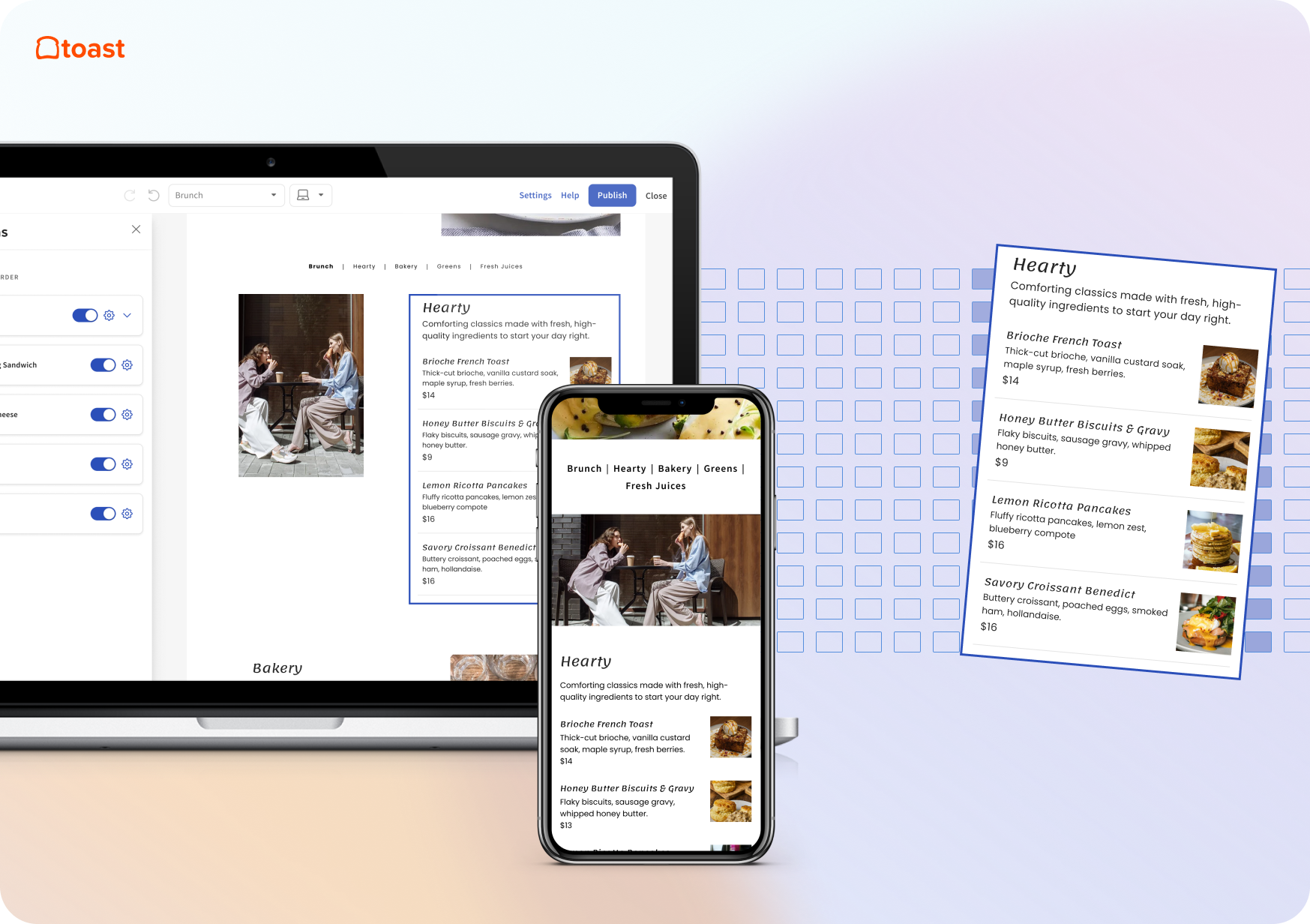
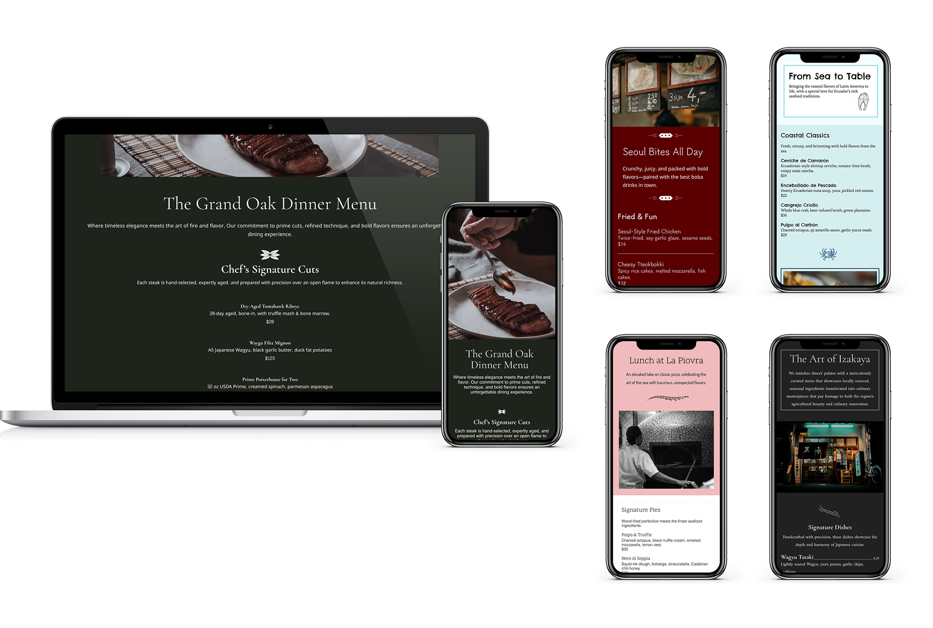
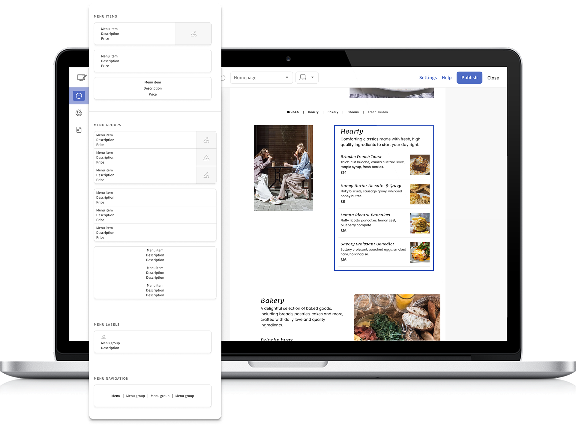
We created an elegant, brand-forward menu experience that gave restaurants the flexibility they were missing without adding complexity. I designed a set of customizable templates that automatically pulled in each restaurant’s existing data, including menu items, photos, logos, hours, and brand assets. Operators could choose which version of their menu to display, whether it matched their printed menu or differed from the online ordering version.
This new menu experience was built using the existing website builder framework, so it felt familiar and intuitive. The drag-and-drop editor and scalable components made it easy for restaurants to create or edit a menu, whether starting from scratch or using a prebuilt template.
User Testing & Research Insights
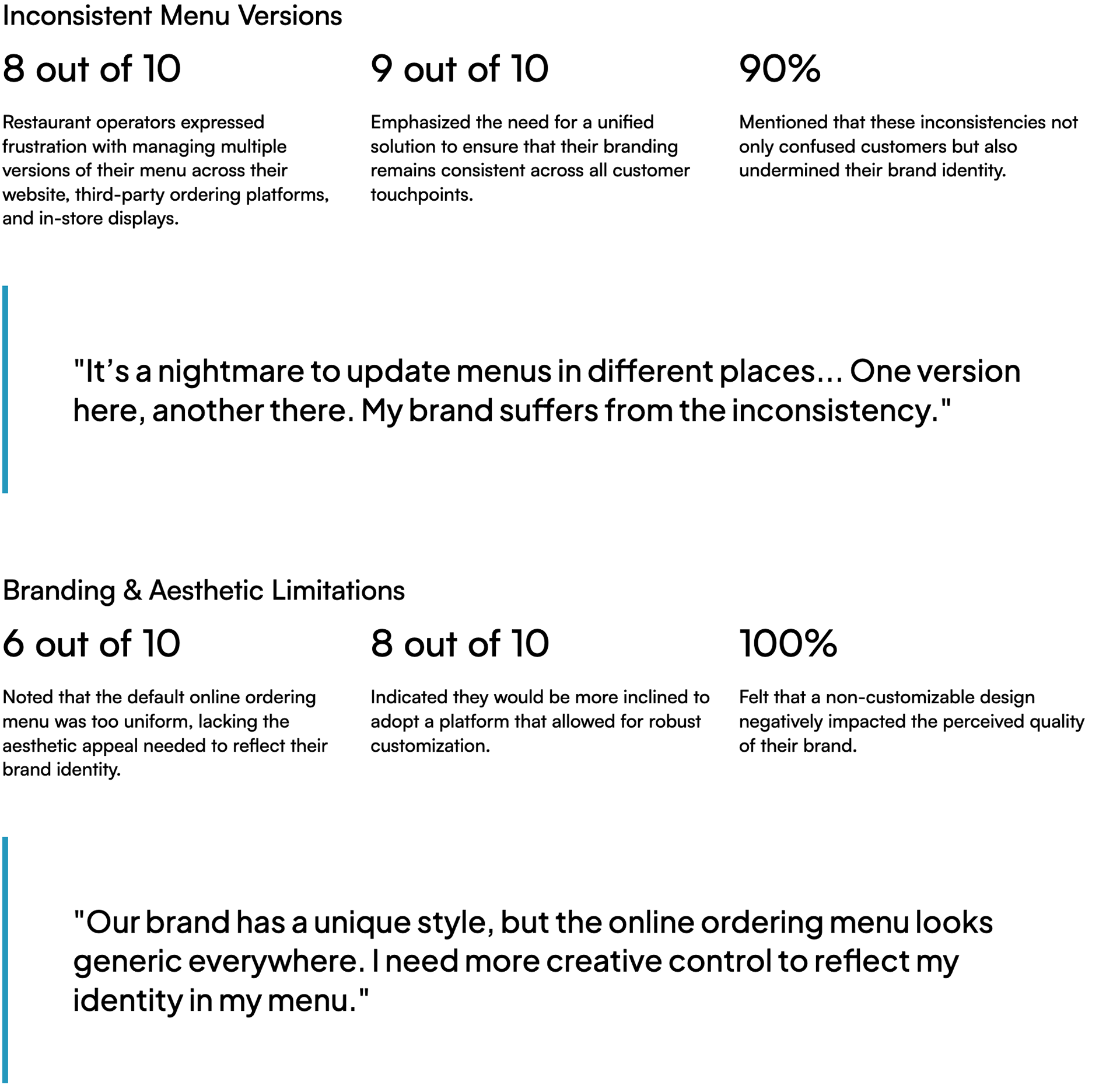
I began the design process by conducting customer research—interviewing 10 restaurant operators and analyzing their feedback to uncover the key challenges they faced with their online menus. The main pain points included:
Goals, Design Roadmap & Phased Implementation
We set the goals for Menu Builder by prioritizing what most restores guest trust and removes operator friction, then sequenced the work so each step unlocks the next.
In Phase 1, Foundation, we end version sprawl with one menu synced to the POS, make publishing fast and safe, and ensure menus automatically look like the restaurant through the Brand Kit.
In Phase 2, Expressiveness, we make choices obvious and scaling painless with clearer modifier pricing, readable layouts, and one reusable layout that works across many locations.
In Phase 3, Suite lift, we make menus easier to find and share and smooth the handoff from browsing to Ordering and the mobile app.
The 2025 roadmap follows this order—P1 in Jan–Apr, P2 in May–Aug, P3 in Sep–Dec—and ties directly to Websites outcomes: fewer edits and tickets, faster time to live, stronger brand fit, better discovery, and cleaner paths to order

Key Features
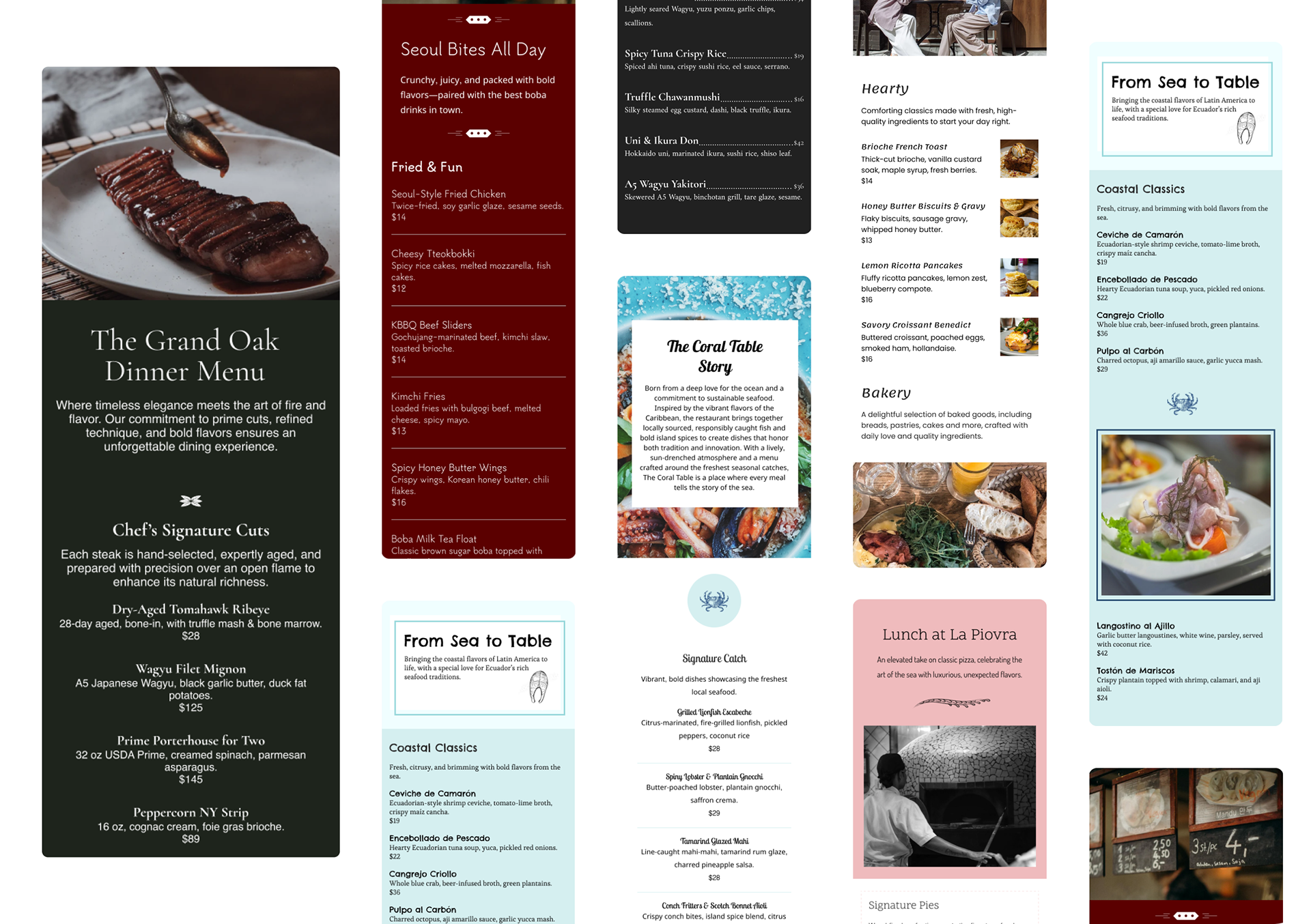
Pre-designed layout families: Bistro, Casual, Modern Card, Photo-forward. Tuned for mobile reading and print-like rhythm.
Component model: Category list, item card, price group, modifier set, dietary tags, photo gallery. All bound to POS fields.
Brand inheritance: Type, color, imagery from the shared Brand Kit with sensible overrides when needed.
Instant preview: Safe drafts, staging links, and light automated checks for contrast, missing prices, and broken images.
Multi-location controls: Share a layout across locations, swap photos or prices based on the POS data behind the scenes.
Structured content: Schema for menu, category, and item to support SEO and rich results.
Design System Alignment
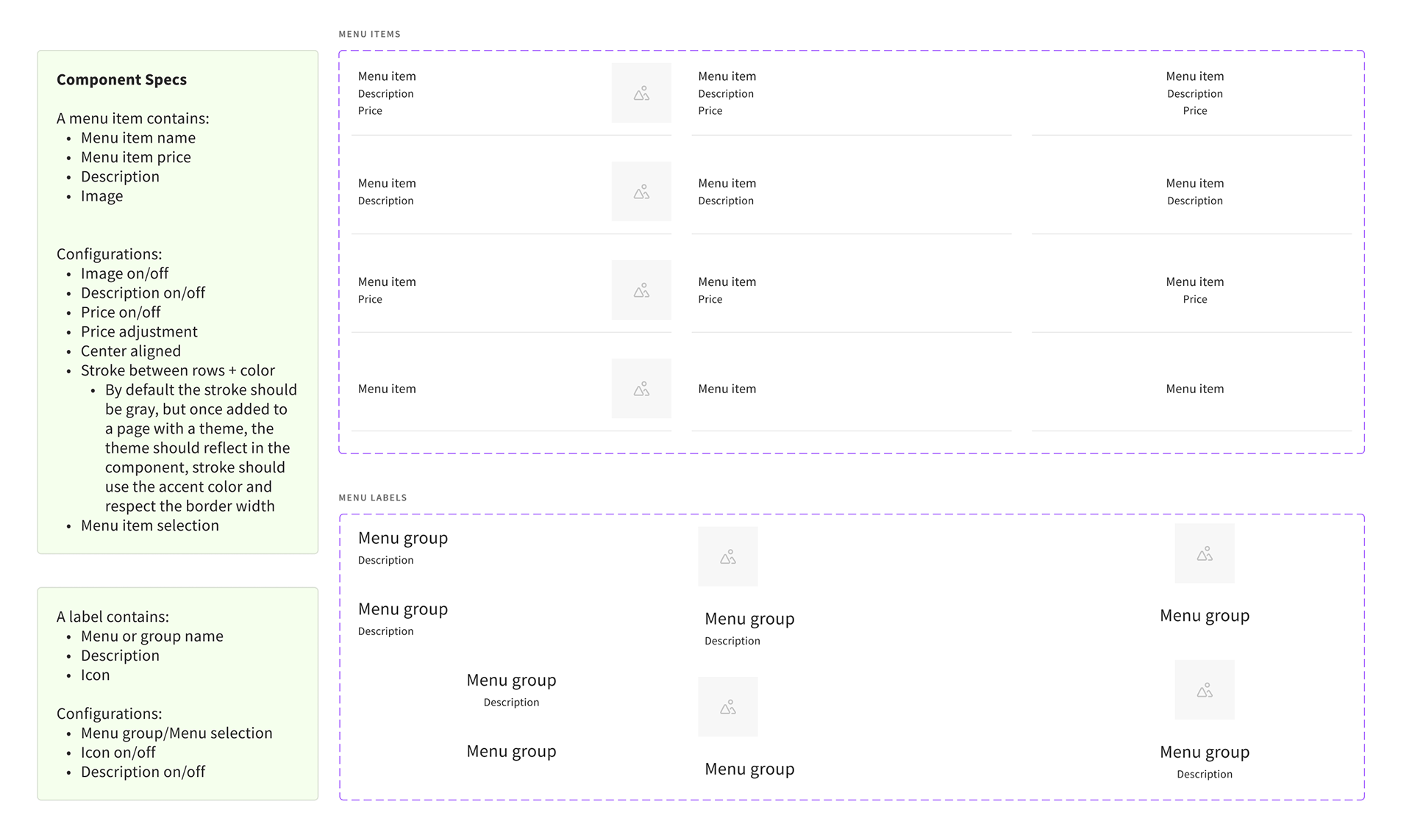
Tokens: Typography, color, spacing, and shadow tokens shared with Websites.
Patterns: Section headers, card lists, filter chips, and CTA placement mirror Website pages for familiarity.
Accessibility rules: 16px+ body, contrast ≥ 4.5:1, readable price ladders, keyboard navigation, alt-text templates for images.
Empty and error states: Guidance when an item is missing a price or photo, with shortcuts back to the right POS field.
Impact on Toast Websites
Single source of truth → Fewer edits, fewer tickets
Modeled to reduce menu-change tickets 15–25% by removing duplicate work and catching errors earlier.
Modeled to reduce menu-change tickets 15–25% by removing duplicate work and catching errors earlier.
Brand-first menus → Higher perceived quality
Consistent type and color raise brand fit and trust; menus read well on mobile, which improves conversion paths.
Consistent type and color raise brand fit and trust; menus read well on mobile, which improves conversion paths.
Faster publishing → Faster time to live
First menu page under 15 minutes for new sites; seasonal updates under 5 minutes.
First menu page under 15 minutes for new sites; seasonal updates under 5 minutes.
Structured content → Better discovery
Menu schema supports rich search results and cleaner internal linking from Website pages.
Menu schema supports rich search results and cleaner internal linking from Website pages.
Suite cohesion → Clearer guest journey
Seamless handoff from Website menu to Ordering to mobile quick reorder.
Seamless handoff from Website menu to Ordering to mobile quick reorder.
What we’ll measure at launch
Time to publish, error rate at publish, brand-fit rating, support ticket volume for menu changes, menu page engagement, add-to-cart starts from menu views.