
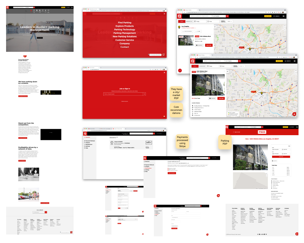
REEFparking.com
Streamlining the current B2B Parking Portal in order to enhance subscription parking offerings to consumers
June 2021 - 3 sprints (30 days)
Role
Design lead
Meet the team
2 designers, 1 UX writer, 1 research manager, 1 design manager, 1 product manager, 1 FE lead engineer, 1 engineer manager
Overview
Since the subscription parking needs of consumers has changed drastically since the beginning of the pandemic, REEF parking business saw an opportunity to enhance their offerings to their B2B partners and introduce flexible billing options.
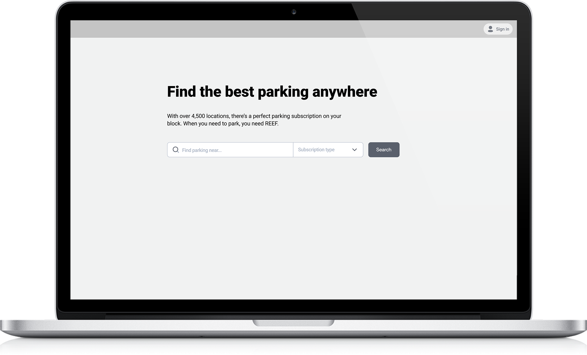
Unfortunately, the Parking Portal web app users were unable to even explore their options or purchase any permits without creating an account or logging in first. By completely revamping the UX, including the search and checkout flows, our team added the necessary features for the B2B expansion while improving the flow for B2C customers.

The Problem
The process of browsing and searching for subscription parking permits can be tedious because it takes customers a long time to find the right permit to fit their needs. Additionally, consumers struggle to purchase subscription parking from the current Parking Portal because they are forced to create an account before they can browse parking options. This confuses our customers and leads to abandonment.
100% of participants said that checking out as a guest was appealing to them and all experienced cognitive overload throughout account creation, searching, and purchasing flows.
How might we streamline the current Parking Portal in order to enhance subscription parking offerings to consumers?
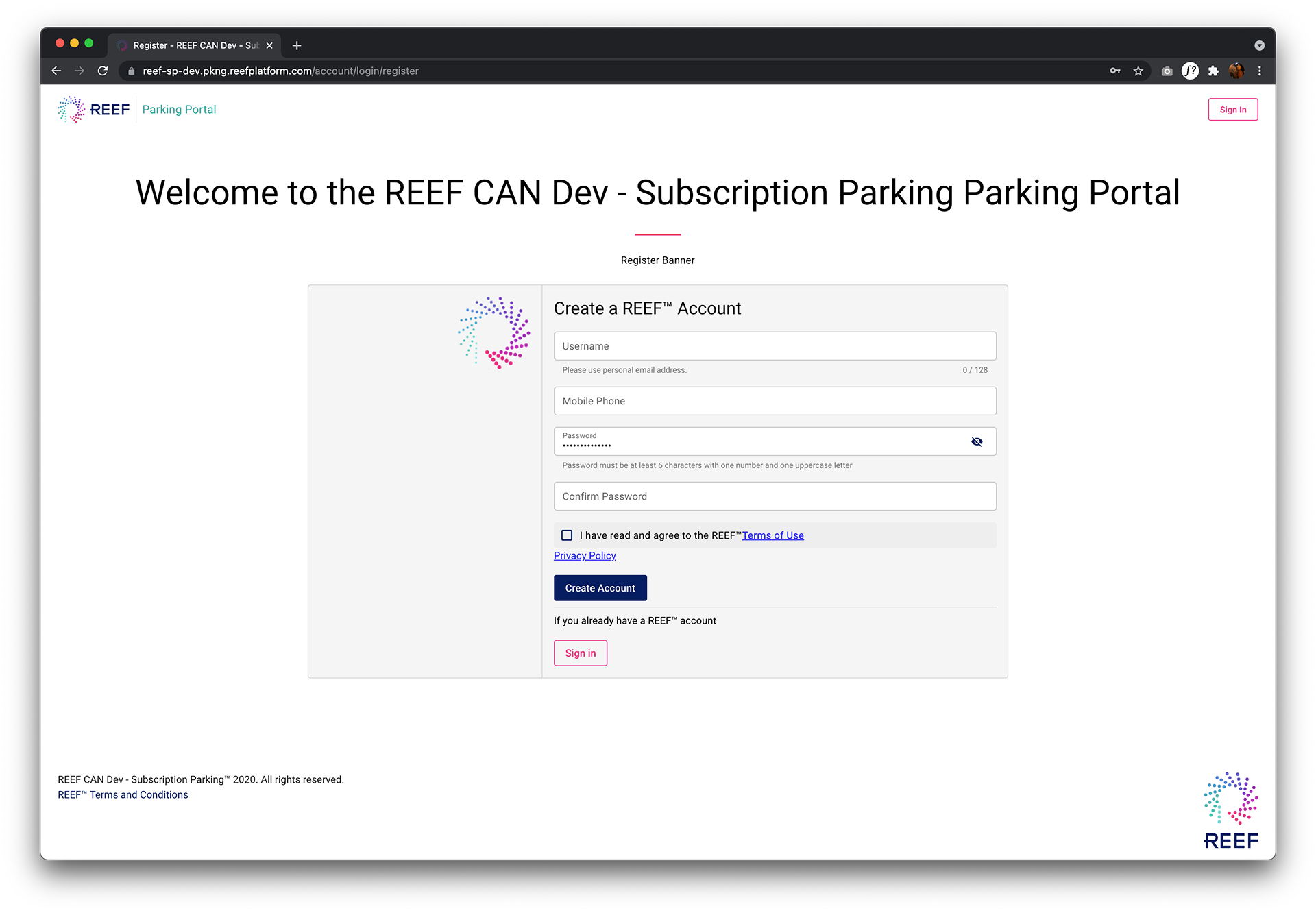
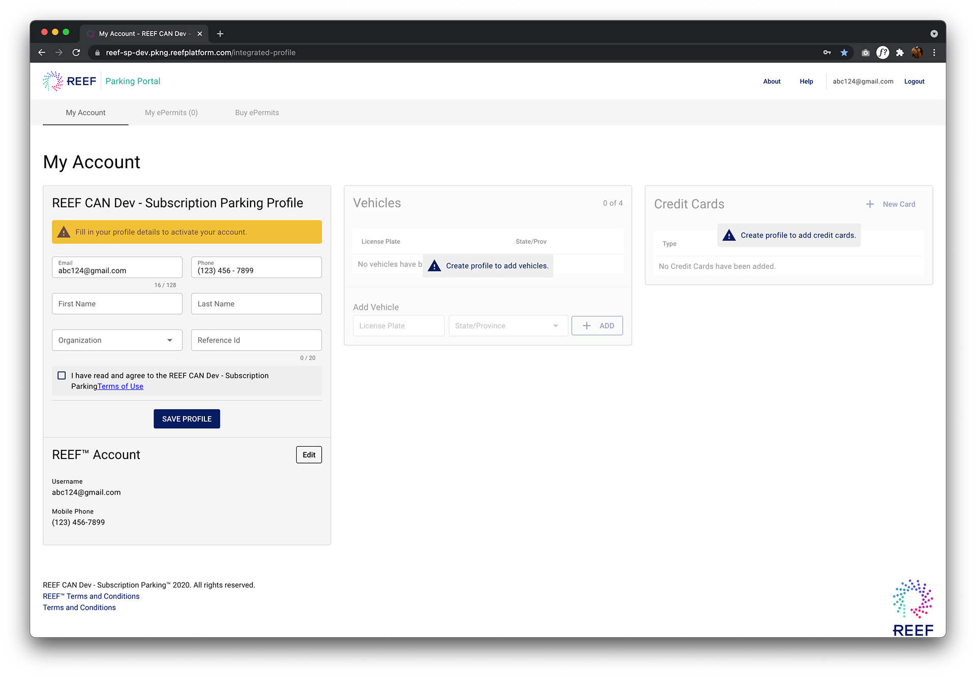
the old UI
What is the business value of enhancing subscription parking offerings to consumers?
Substantially grow the user base for REEF ecosystem by capturing all MPS users
Achieve greater cash flow by eliminating dependency of accounts receivable
Provide industry best UX for B2E, B2B and B2C users
Enhance subscription parking offerings to consumers
Amalgamate all brands subscription parking offerings into one REEF storefront
The process
Following a design thinking methodology, we user tested the current Parking Portal, conducted a heuristic analysis and created a user journey for Pandemic Pam-our subscription parking persona. Through this process we were able to empathize with consumers and validate the top priority improvements necessary for the MVP.
Prioritized improvements
1. Create a clear path for users to buy their permits by allowing them to check out as guests
2. Create hierarchy of information on permit cards with supporting copy so that users can understand what they are purchasing
The solution
Checking out as a guest

Current state
Users were frustrated and confused that they had to enter a login or create an account before viewing their options
Redesign
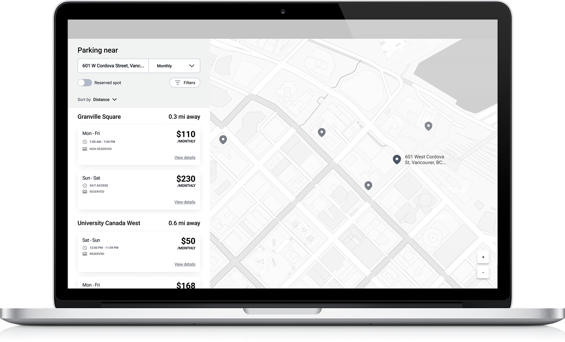
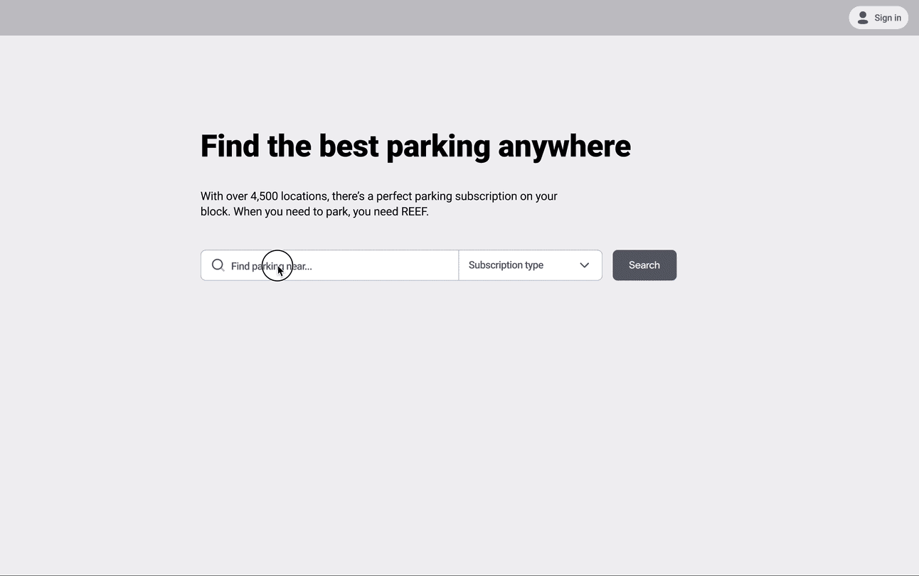
Allow users to search a point of origin and select a subscription type before entering the search flow
Allowing them to select the parking type filters the search results to help the user stay focused on finding the best permit to fit their needs and saves them time

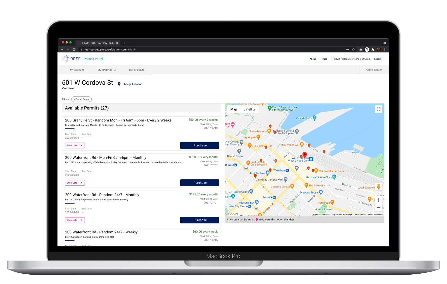
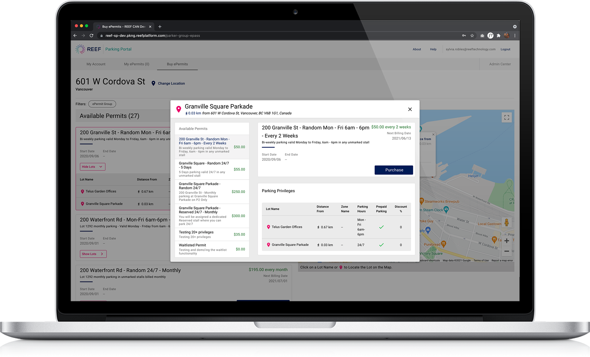
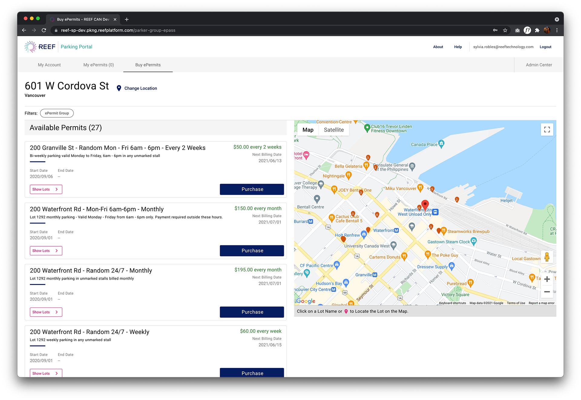
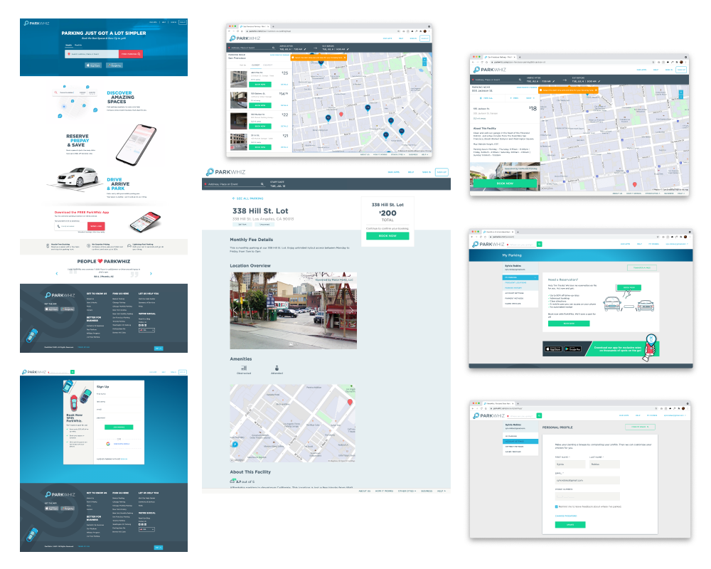
Current state
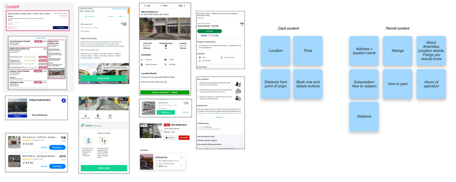
Each of these cards here represents one permit. Different lots and garages can contain multiple permit types. In user testing, no participants were able to make this correlation, and assumed these were locations. There was confusion about the show lots CTA, the intention was to show the different locations that a permit can be used at- which no user understood either.
The permit naming convention confused users as well, and the majority of users did not understand what they were about to purchase
Redesign
Users expressed wanting to know how far the lots were from the point of origin so we included that too. Also, we included interactions between the permit cards and map pins to make it easy for users to identify which lot they are purchasing a permit from.
In user testing we saw that 3/4 users preferred to use the map as discovery so we updated the layout to reflect current UI patterns in the real world.
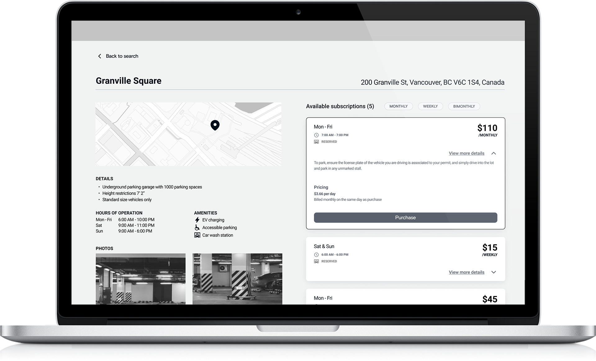
Create hierarchy of information on permit cards with supporting copy so that users can understand what they are purchasing
Current state cards
The permit cards hide information about lots, and gives information that is not relevant to the user, like the start and end dates which are only important to the admin who created the permit. The distance from the point of origin is also hidden.
The description and naming convention of the permit are also hard to understand.
A constraint of no constraints: Permit card naming convention
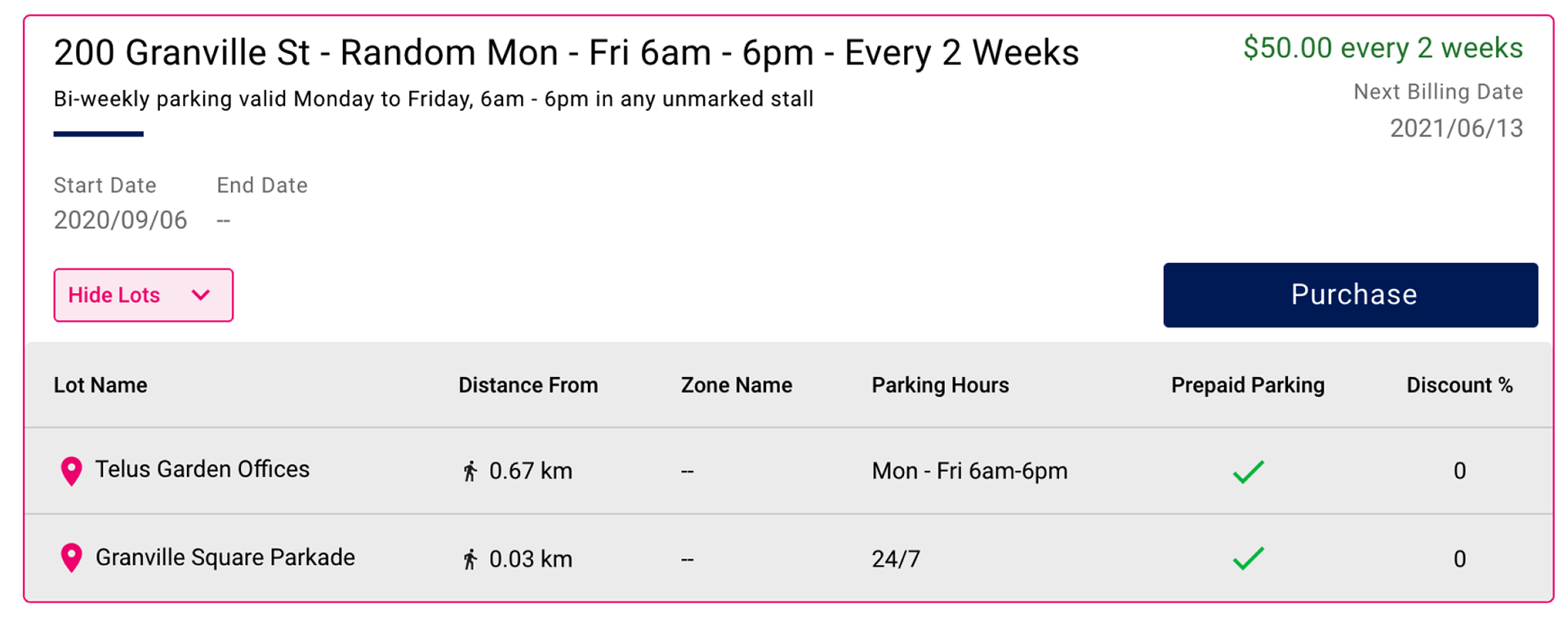
In Storefront, where admin users (parking lot managers) create these permits, there is no standard naming convention. Any permit sold through REEF sales channels concatenated to location+parking spot type+Valid days and times+billing frequency.
Allowing admin users to name their own permits could also open a can of worms. The most important things they wanted to see on permit cards were valid days and times, pricing, and distance.
Redesign
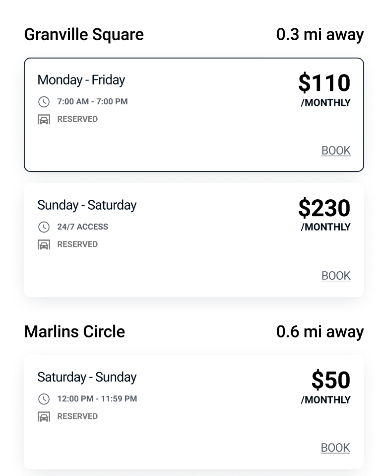
The permit card redesign improved issues with understanding pricing and permit types. We clearly show the valid days and times a permit can be used, whether the parking spaces are reserved or random, and we grouped permits location. We also gave the distance more emphasis.
In user testing we observed that users did not care about lot names or addresses, and they preferred to rely on visual interactions between the permits and the map.
Explorations
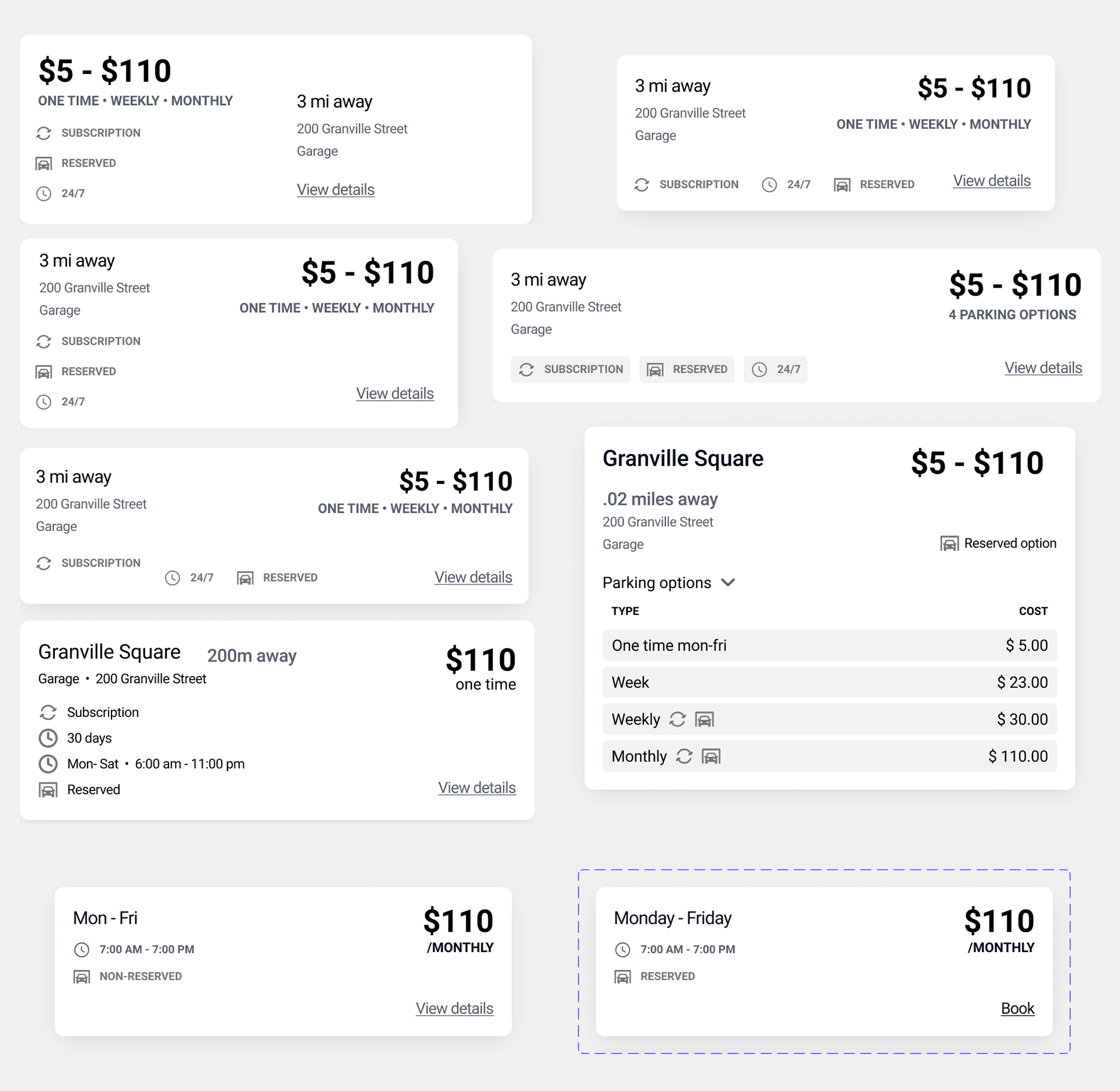
We explored what permit cards would look like if they were based on permits per location vs locations and the permits available at that lot.
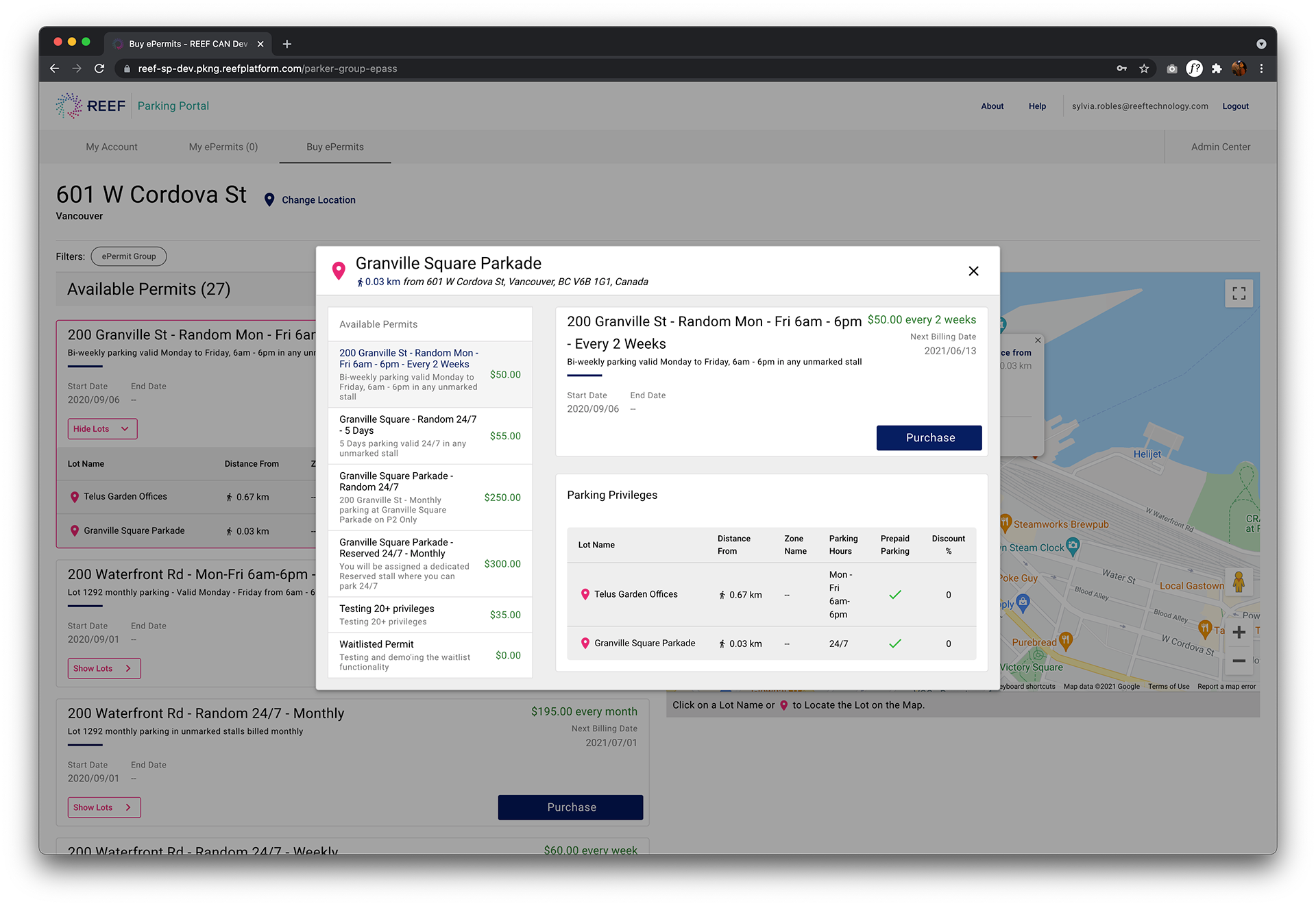
Location details
All users were confused about this modal. They did not understand that this was a location detail, and they were being shown the different types of permits available at this location.
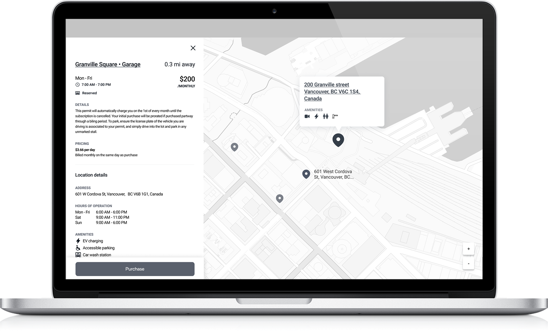
Redesign
Since we decided to group permits by location, we were afforded more space to give all the details users expressed needing in order to feel confident in what they were purchasing.
We display the location and distance and a per-day pricing break down of what they are paying for.
For users with safety concerns needing more information about the lot, we included amenities.
Getting started...
Heuristic analysis
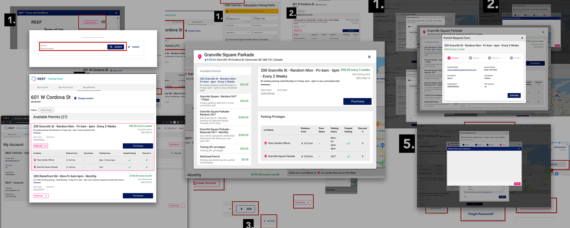
We decided to dig deeper on usability issues in the current Parking Portal and provided recommendations. Based on a short heuristic analysis checklist, we identified inconsistencies in task-oriented design elements, usability, copy, content hierarchy issues, and content relevance-as well as an overwhelming checkout process with unexpected modals on top of modals on top of modals.
Recommendations
Incorporate hierarchy through appropriate use of H1, H2 etc, consistent color application, and grouping. This is essential to the permit information so that users can easily compare, decide and purchase
Collaborate with UX writer to add helpful instructional copy to educate and inform user
Remove unnecessary information on screens that distract and confuse rather than assist user
Redesign of flow will allow user to browse as their first action, be shown relevant information, and asked to provide only essential information in an order that matches what they are used to on other sites (checking out as a guest)
Testing the current Parking Portal
Primary learning objectives
Observe behavior and interaction with the Parking Portal
Gather feedback on search and shopping flow
Validate checking out as a guest (allowing users to shop for a permit without having to sign in/create an account)
Gather feedback on checkout flow
"Guest checkout is always a good option"
"I want to see what's available before I give any information at all. Leaves me a little frustrated"
All users found checking out as a guest appealing and wanted to browse before entering any personal information
All users wanted clarification on what fields were required in advance
All users questioned required information to continue searching for a subscription
"So, how much am I paying per day? The large amounts are a little tricky for my brain you know? Like I have to do a little gymnastics because the pricing isn't equal across the cards"
"There should be some way to neatly show the information I need in this card... Lot name is not that important... I don't care that much about lot name"
"This language is technical, I wouldn't understand it as a regular consumer"
All users wanted sorting and filters
Most users were confused by the naming convention of the permits and information on the cards
All users did not understand the "show lots" CTA
Critical updates / Recommendations
Support checking out as a guest for all users
Clean up hierarchy and functionality of permit cards and search results page
Results
We shared our insights and reports with our engineering team. Together our team collaboratively estimated which high priority improvements could be implemented in REEFparking.com 1.0
Research... so much research
Wireframes


Next steps
Explorations for the location detail page had been started but at this point we wanted to pause and test the wireframes and flow so far.
Unfortunately, as user testing began, the organization paused the subscription parking campaign and our team was shuffled to provide support to higher priority campaigns.