
Overview
REEF kitchen employees often encounter obstacles that may make it impossible for them to complete orders as expected. These obstacles range from limited inventory to damaged or inoperable equipment and everything in between. The pause feature of the Kitchen Display System (KDS) prevents orders from being received that a kitchen may be unable to fulfill.
Timeline: 1 Sprint
Role: UX/UI Design
Deliverable: Interactive Prototype
The Problem
There are three use cases which must be covered by the pausing feature. The first is the need to pause (and, of course, resume) orders for the entire kitchen. The second is for pausing just one brand that is supported by the kitchen without impacting the other brands which the kitchen supports. The third is to pause orders from a specific delivery platform such as Uber Eats or DoorDash.
How might we provide KDS users maximum flexibility while pausing and resuming order intake without needlessly complicating the UI?
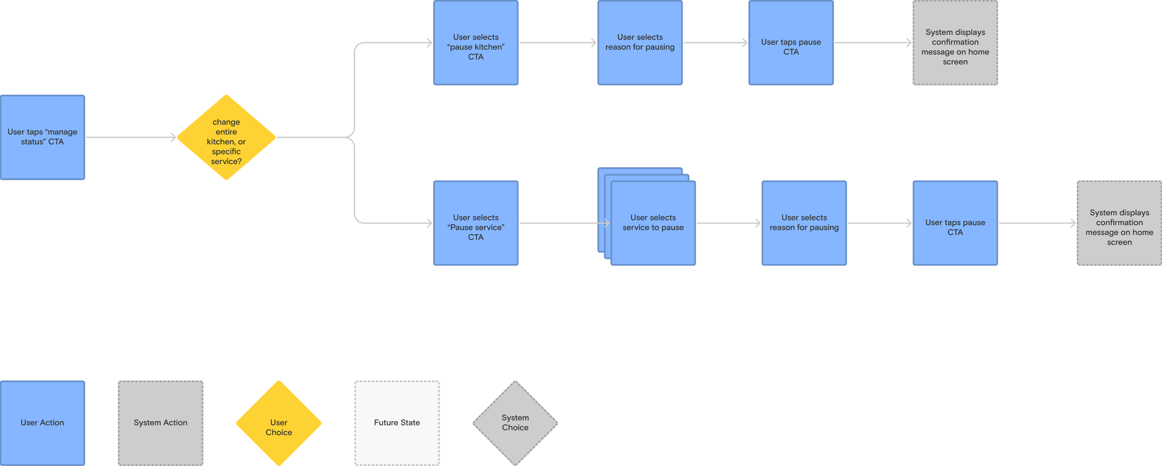
User Flow
Once we received the feature requirements from the product owner responsible for this feature we began to map potential user flows. We began by mapping the userflow for the current state (not shown here) of this capability. This starting point helped us to understand where we should prioritize our efforts to adapt the the flow in order to support the new functionality needed for this use case.
Before we arrived at the user flow shown above, we explored two earlier iterations. These two user flows represent two alternate approaches to achieving the outcome required for this use case. The first user flow was designed with the assumption that a user might think first of the reason they must pause service, and gave them to ability to report an issue. This put the responsibility of knowing what types of issues warranted pausing a kitchen or service on the system rather than the user. The second flow was a much more condensed experience which satisfied the feature requirements exactly as they had been written and no more. Our rationale behind creating these two was that they would represented the opposite ends of the complexity spectrum that the finished product may ultimately lie within.
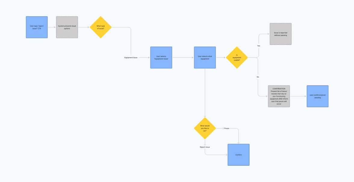
The “robust” flow; while this flow may have covered broader use cases it contained three times as many decision points and would have required significantly greater development effort to achieve.
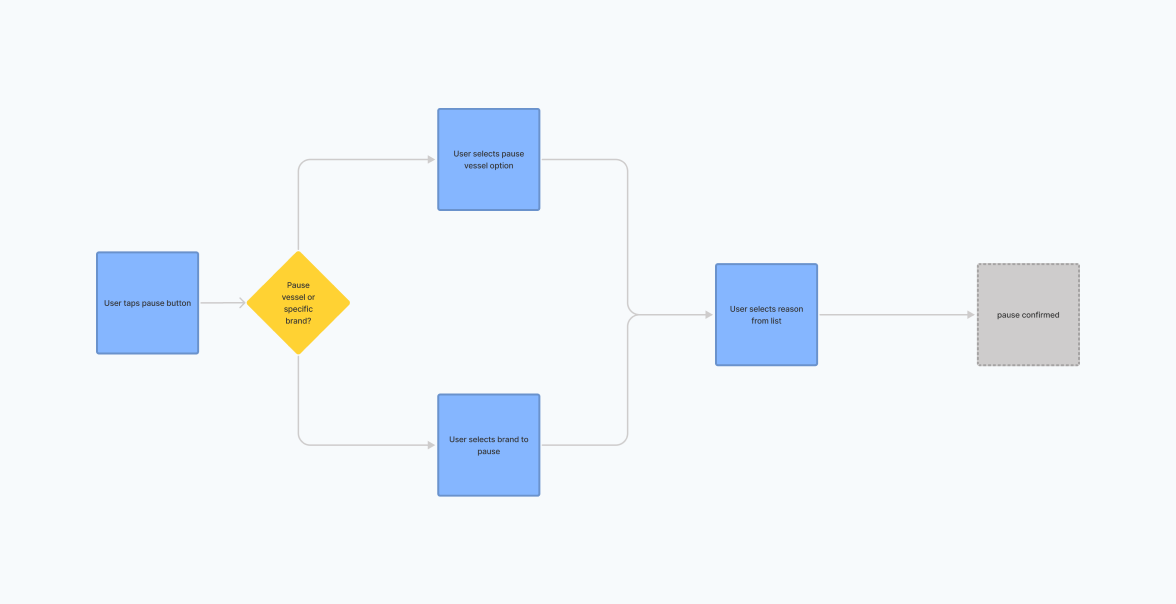
The “MVP” flow; short and simple, this flow met the stated requirements but left something to be desired. The final flow resembled this flow much more closely than the “robust” flow.
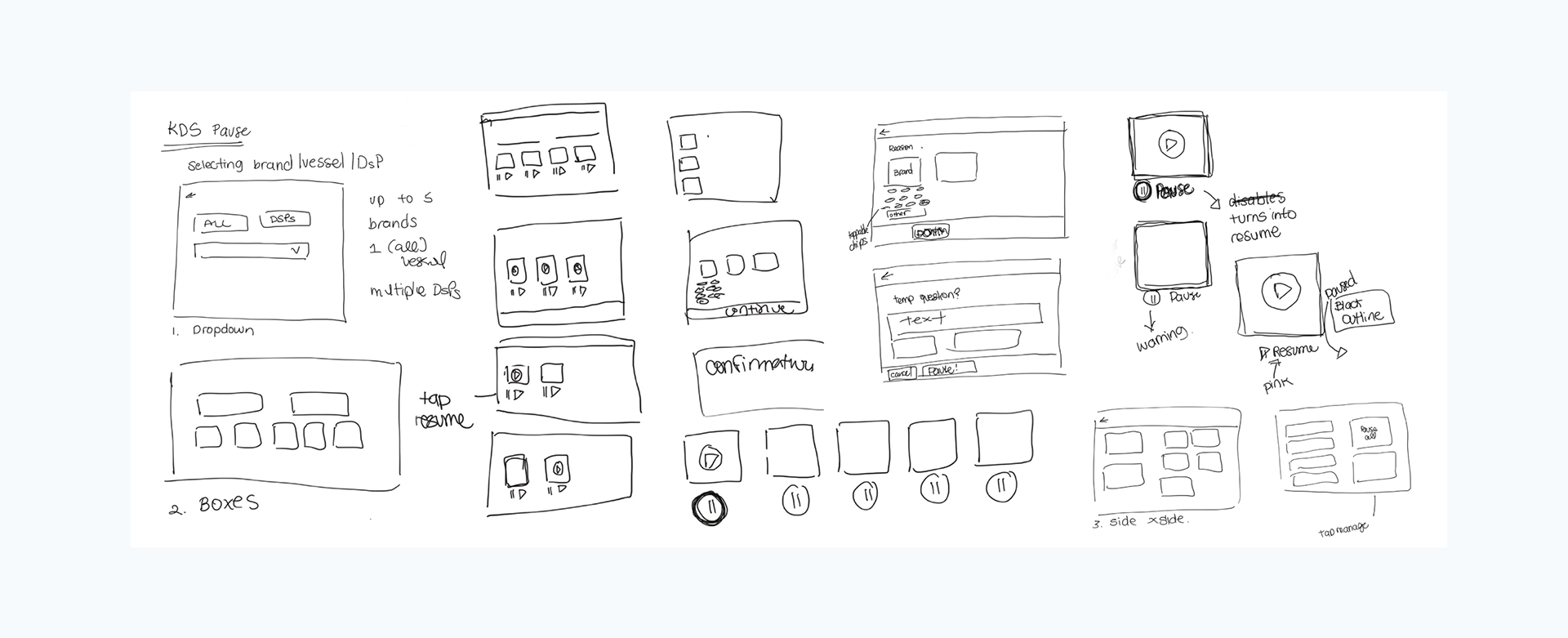
Sketching
Drafting some early concepts helped us to think visually about the components that would be needed in order to complete this flow. A few patterns emerged thrroughout these sketch iterations such as large buttons and stacked options. This exercise gave us a good starting point to begin low fidelity prototyping and guiding which patterns and components we should seek out during visual research.
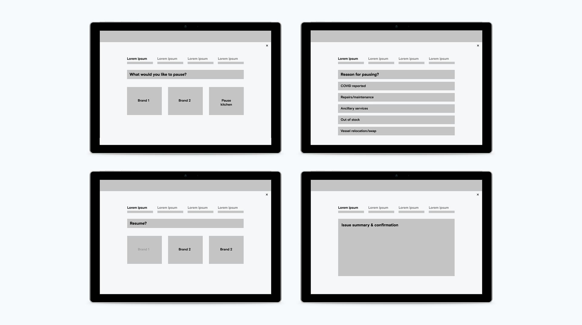
LoFi Wireframes
Using our concept sketches as a guide we created a round of low fidelity prototypes to translate the userflow into pixels. Practicing rapid prototyping allowed us to swiftly gather valuable feedback from the product owner we were collaborating. Even though these prototypes did not tell the whole story, they offered a starting point to have more detailed conversations about the interactions users would have within each page and each component.
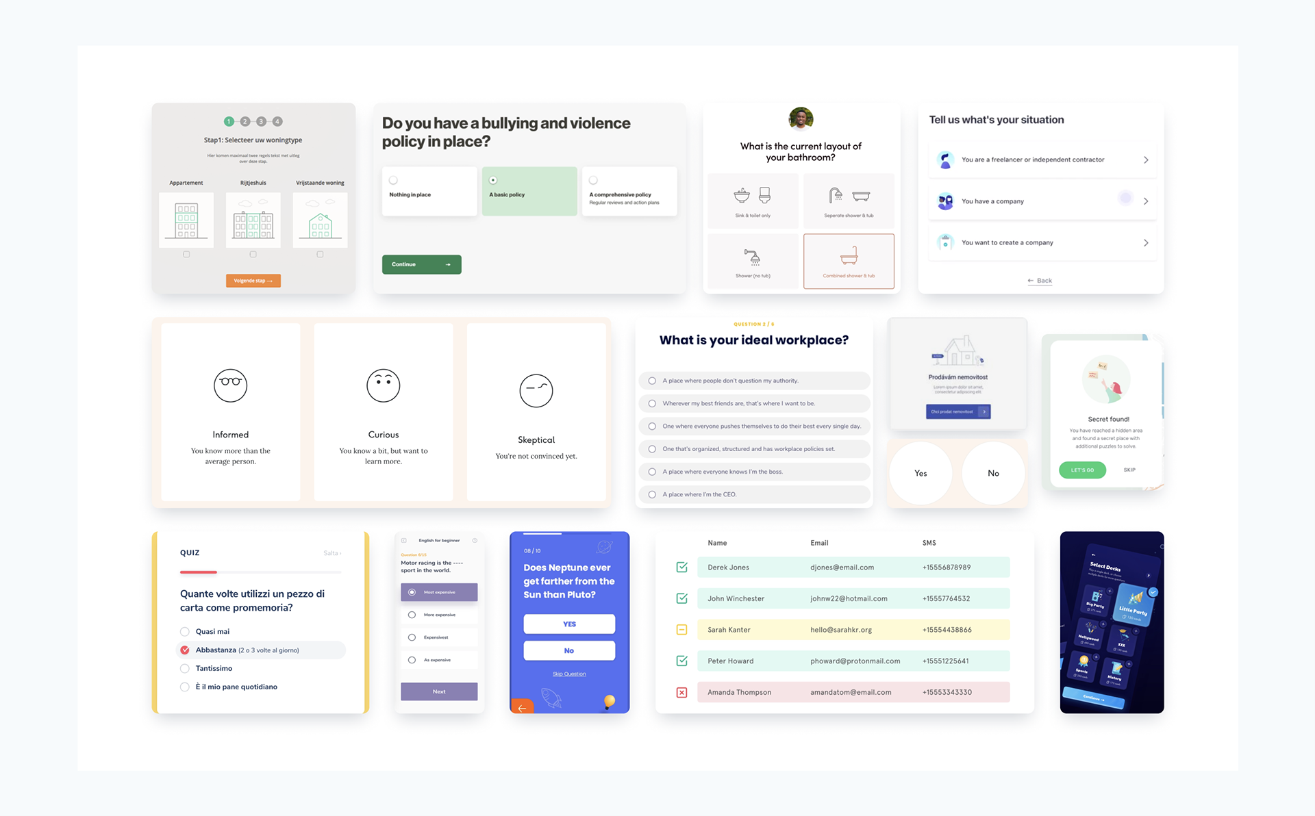
Visual Research
A professional kitchen can be a hectic working environment - especially during a lunch or dinner rush. While we were laying out the foundations of our screen layouts and brainstorming components, we kept in mind that large and easily recognizable patterns would go a long way in helping the users recognize what actions they can take with minimal cognitive effort. While seeking UI inspiration the patterns that stood out to us contained large bold text, simple layouts, and clear yet subtle iconography.
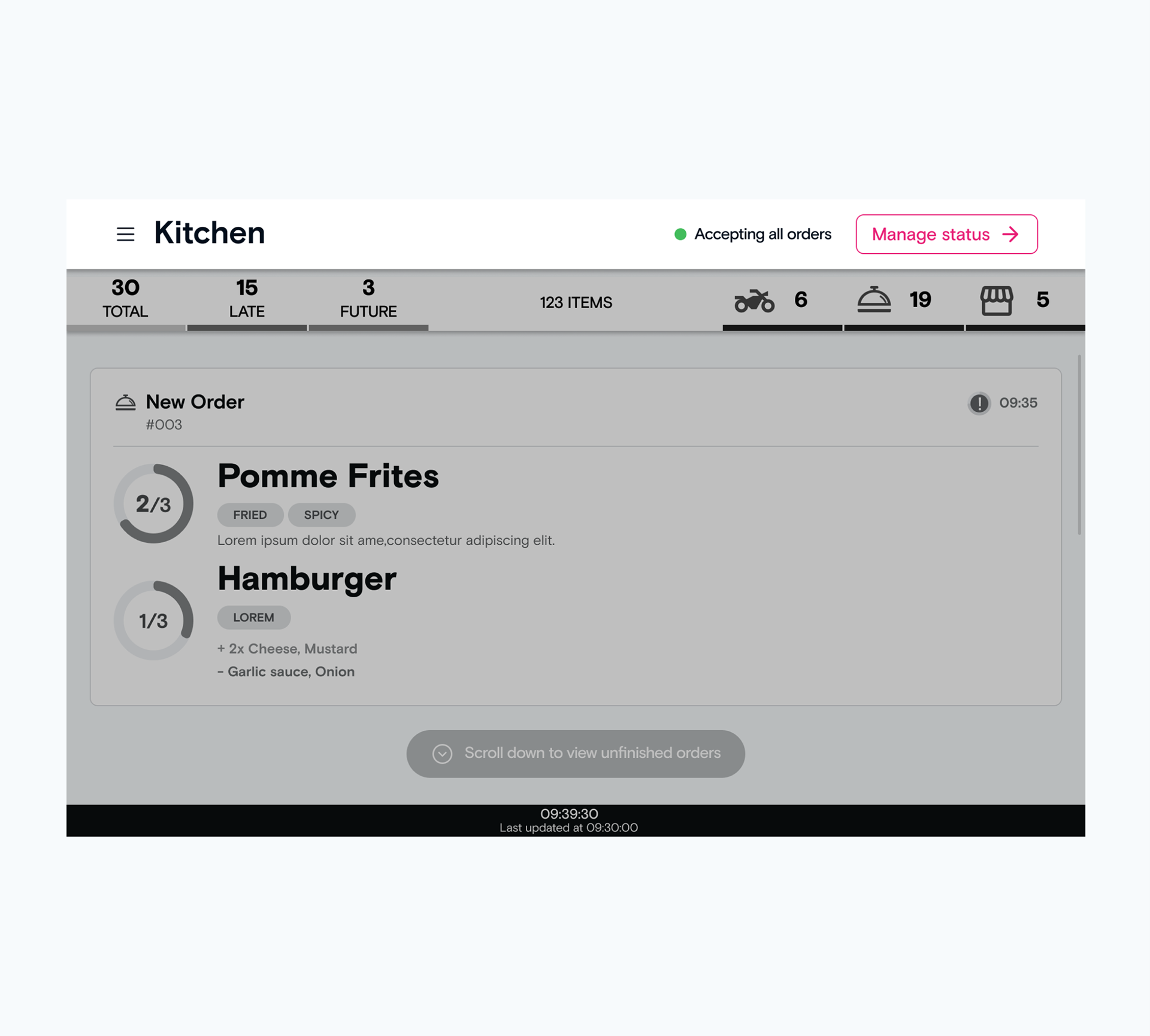
Live User Testing
The testing was quick and scrappy, I used wireframe prototypes. I had the pleasure of being able to connect with staff in the kitchens and do live user testing.
The feedback we received was positive, and it was very clear how badly the staff needed this feature.
The feedback: copy needs to be more clear, and colorful illustrations could help when the kitchen is hectic, to help the staff differentiate the actions
High Fidelity Prototype
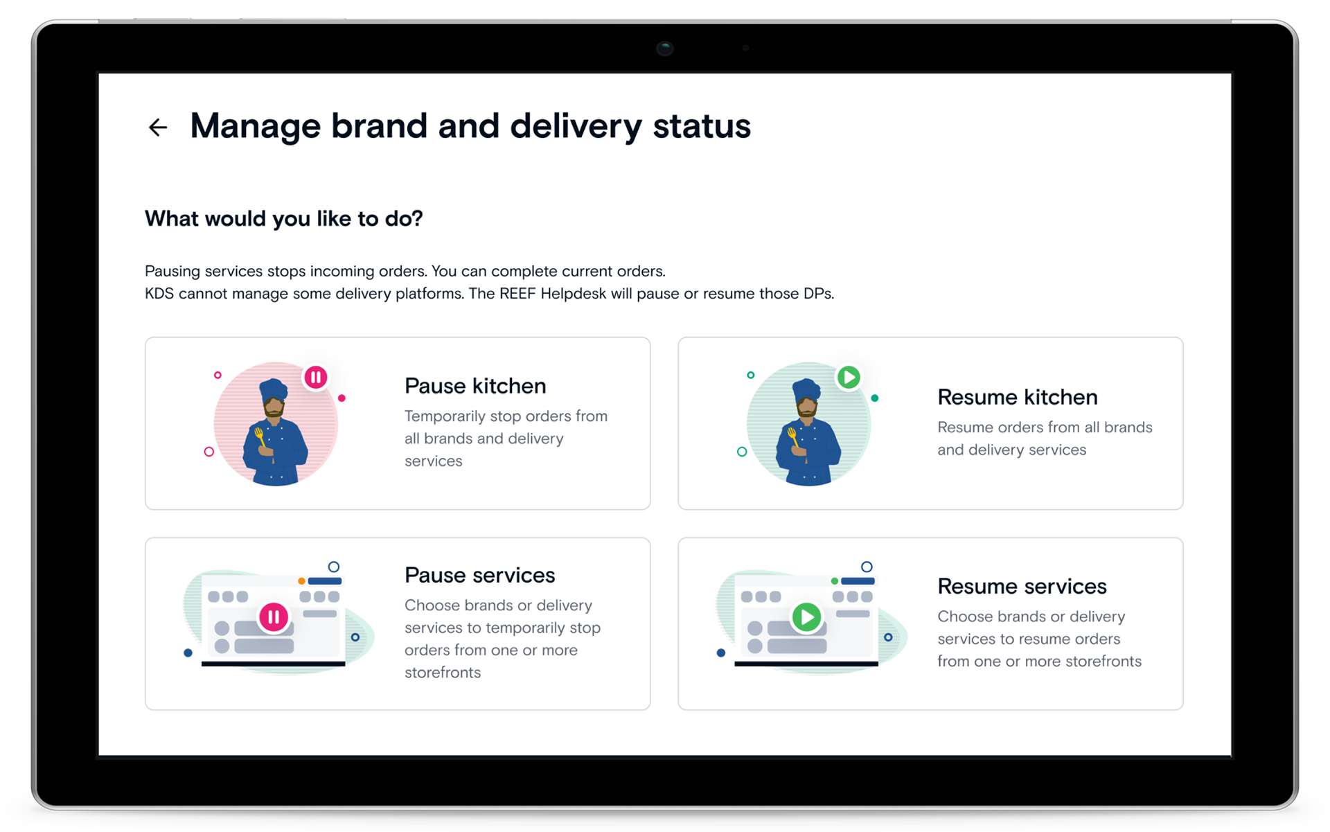
On the home screen, we changed the style of the button to launch the pausing to match the “secondary button” styling. This new style is a better reflection of this features place within the action hierarchy than the “primary button” styling which preceded it.
We also included a status indicator to the left of the button to provide context on the current state of the kitchen’s order acceptance. This component provides system status insight which updates based on the actions taken within the pause flow.
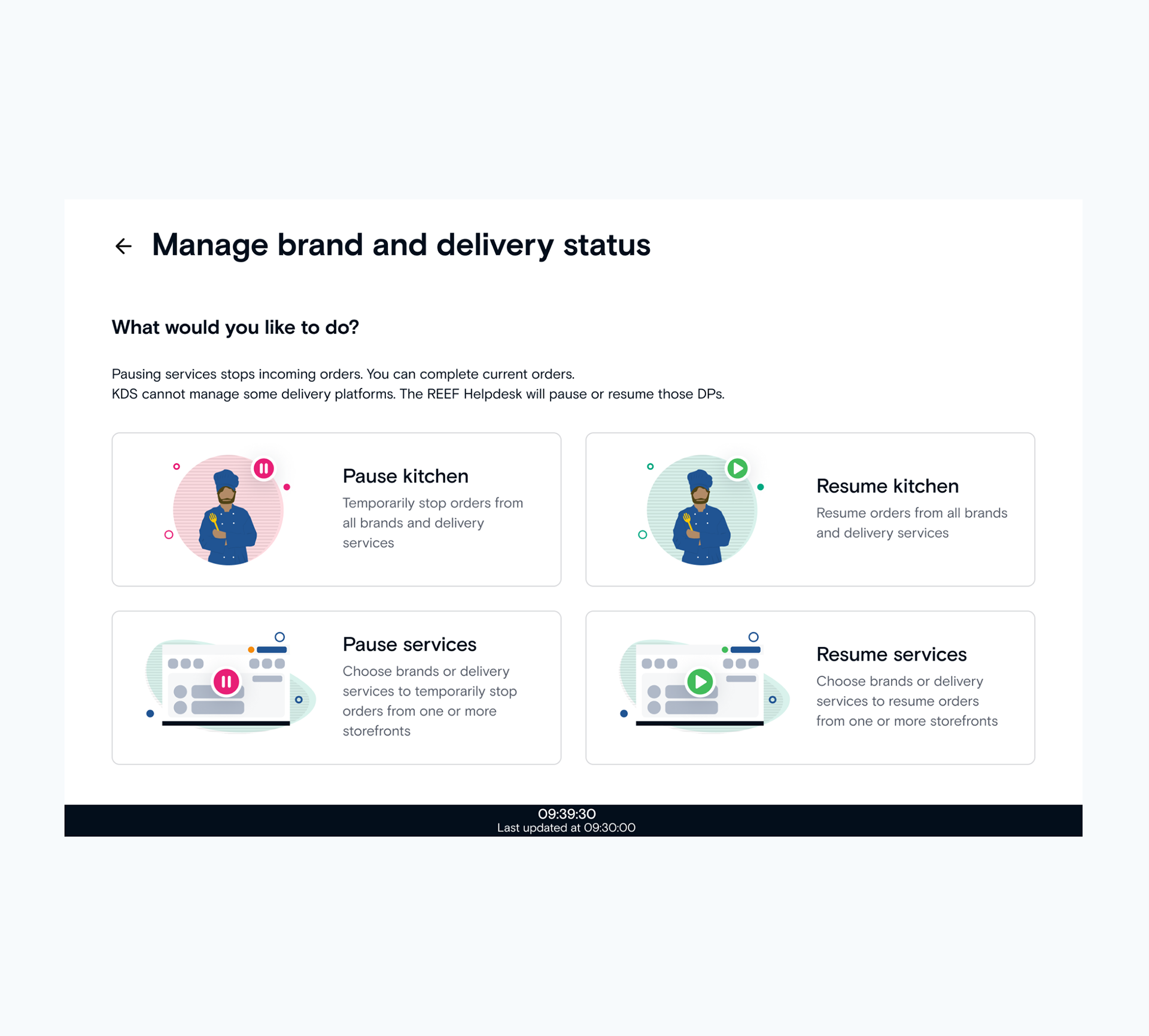
This screen presents the user with 4 separate entry points to choose from. We opted to treat pausing and resuming separately in this way in order to reduce decision complexity later in the flow.
Clear and instructional text written in a conversational tone guides the user toward their goal. The use of illustrations and color break up an otherwise dense interface while aiding with recognition of the options available.
Clear and instructional text written in a conversational tone guides the user toward their goal. The use of illustrations and color break up an otherwise dense interface while aiding with recognition of the options available.
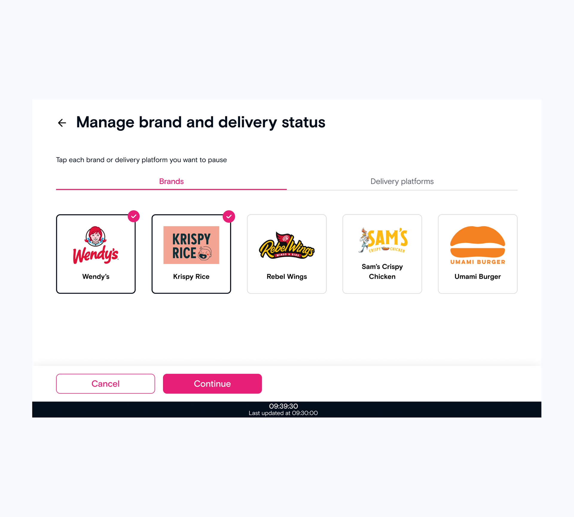
When pausing a specific service, such as a brand or delivery platform, users will select which services they wish to pause (or resume) from this screen. Since this is a required action, the “continue” CTA is disabled until at least one reason is selected.
We opted to display the brand logo for each of these services to aid with recognition.
We opted to display the brand logo for each of these services to aid with recognition.
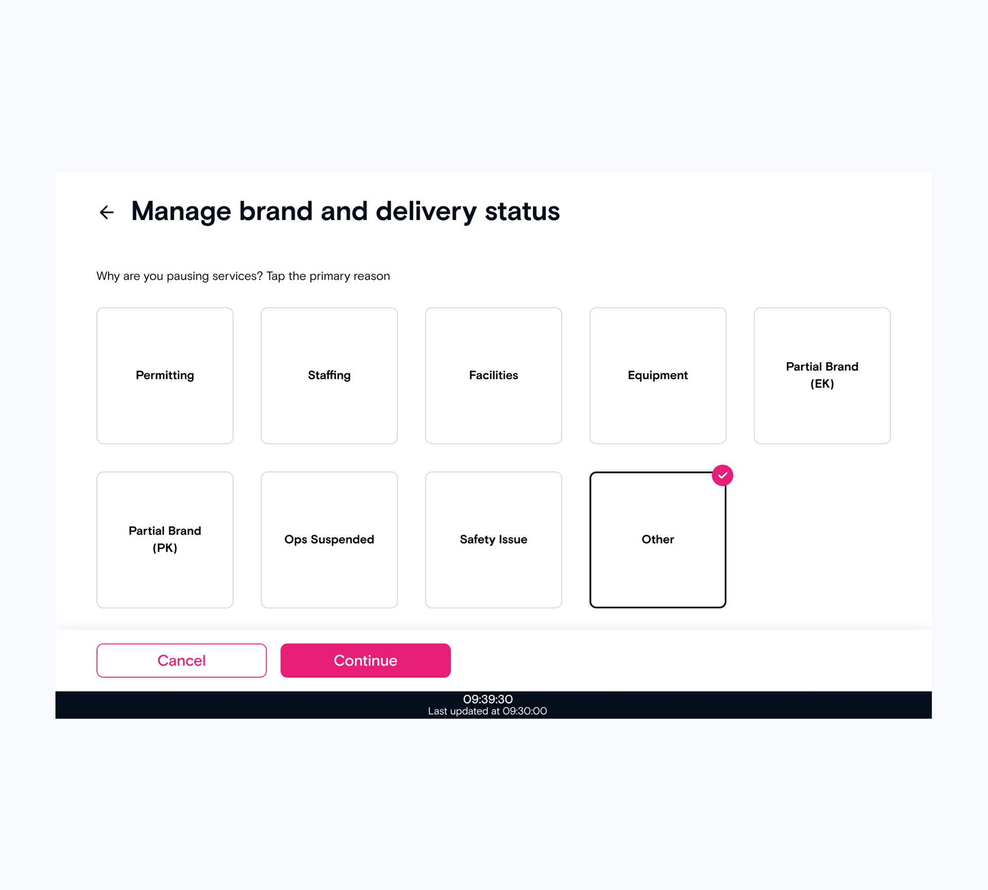
Users are required to select a reason for pausing kitchen service on this screen. Similar to the selection of services, the “continue” CTA is disabled until at least one reason is selected.
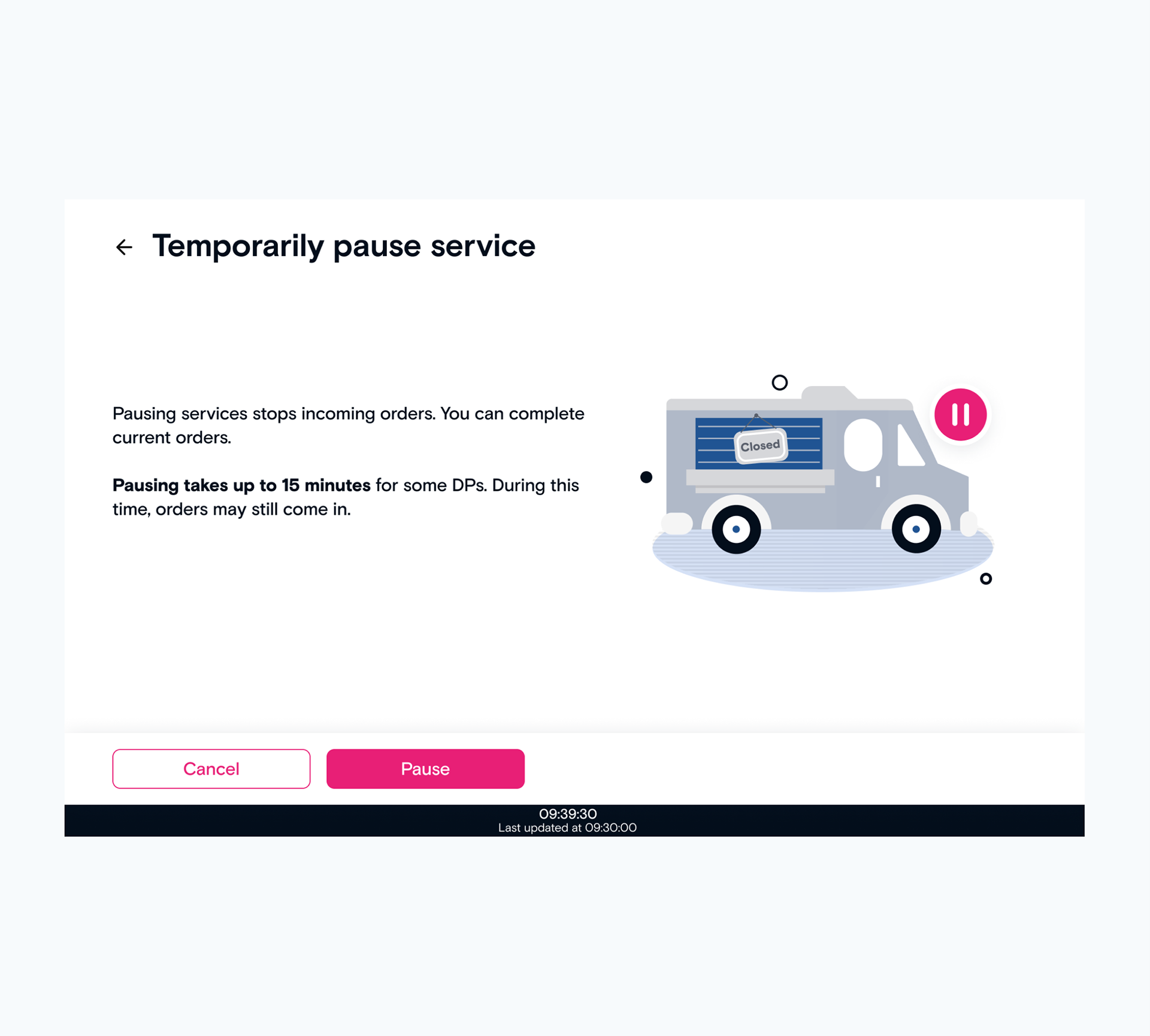
In some cases a kitchen may still receive orders for a short period after the user has paused service through this flow. This is due to a manual step which must be taken by offsite support staff for a certain types of orders.
We increased the font weight for the most critical piece of information on this page to ensure the central message of the screen would be recognized if a user were too scan briefly rather than read thoroughly. It is worth noting again that users of this interface will be working in a high-pace work environment and may be attempting to complete this task as quickly possible so as to pause service before any new orders are received.
We increased the font weight for the most critical piece of information on this page to ensure the central message of the screen would be recognized if a user were too scan briefly rather than read thoroughly. It is worth noting again that users of this interface will be working in a high-pace work environment and may be attempting to complete this task as quickly possible so as to pause service before any new orders are received.
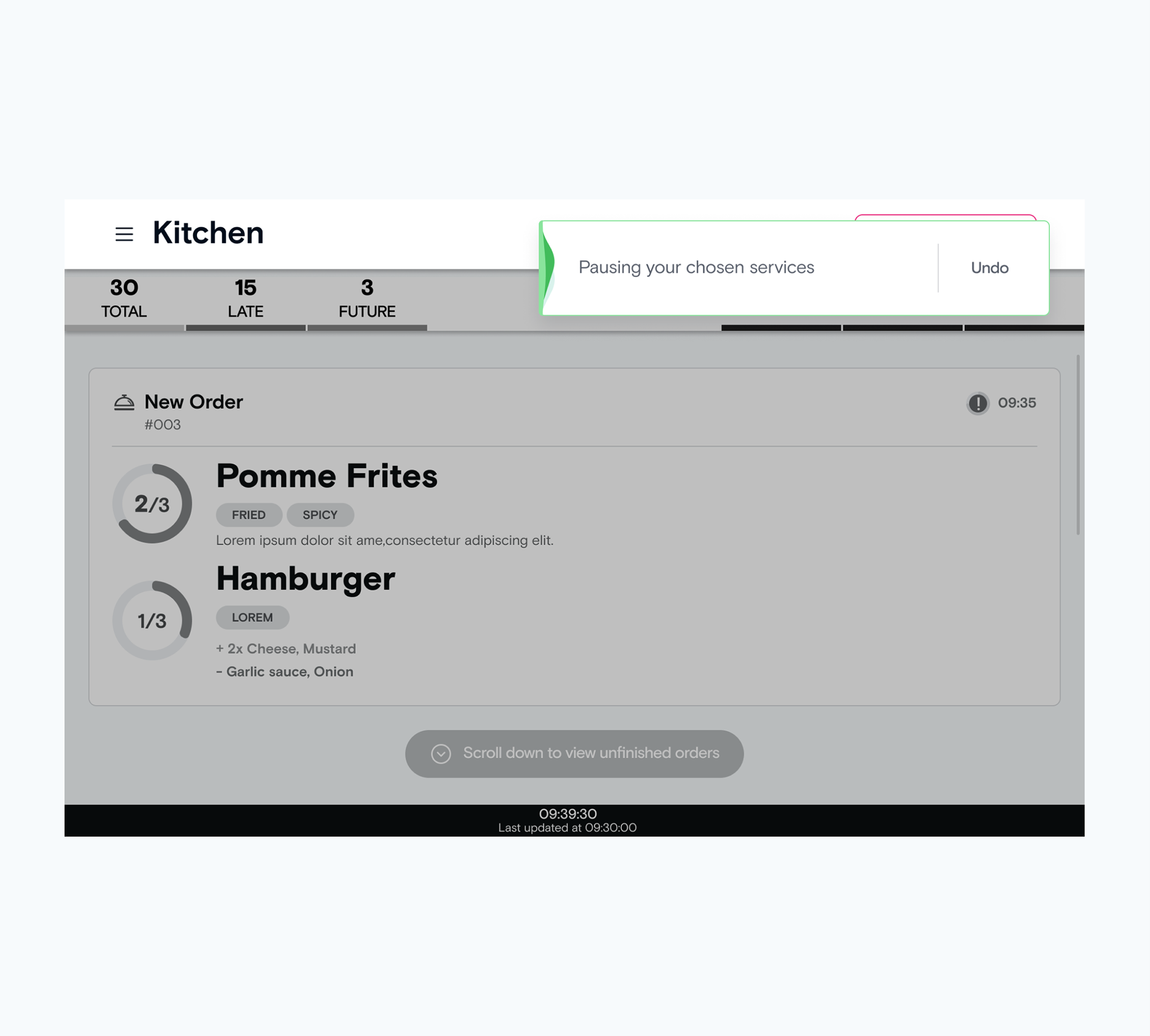
After completing the flow, the user is presented with a success message in the form of a low level message component. This component persists on the screen for 5 seconds before auto-dismissing. It’s color and text are dependent on the techinical success of the pausing/resuming action as well as the presence of any manual actions to be taken by off-site support staff.