TLDR; Redesigned the onboarding experience for Toast's digital storefront suite, streamlining the process to boost customer confidence and activation rates. By integrating branding tools, flexible product setups, and real-time previews, the project achieved a 64% increase in task completion and reduced support tickets by 30% year-over-year.
My Role & Team
I was the lead designer collaborating with two product managers, an engineering manager & an engineering team. This project was completed in 3 months.
I was responsible for the UX, research and strategy of this project, along with designing the manual flow
I was responsible for the UX, research and strategy of this project, along with designing the manual flow
The Challenge:
Restaurants using Toast's Digital Storefront Pro Suite faced a disjointed and unclear onboarding process that hindered their ability to effectively set up their online presence. This resulted in low task completion rates, high customer churn, and an increase in support tickets, highlighting the need for a streamlined and intuitive onboarding experience that instills confidence and aligns with customers' branding and operational needs.
Early Insights
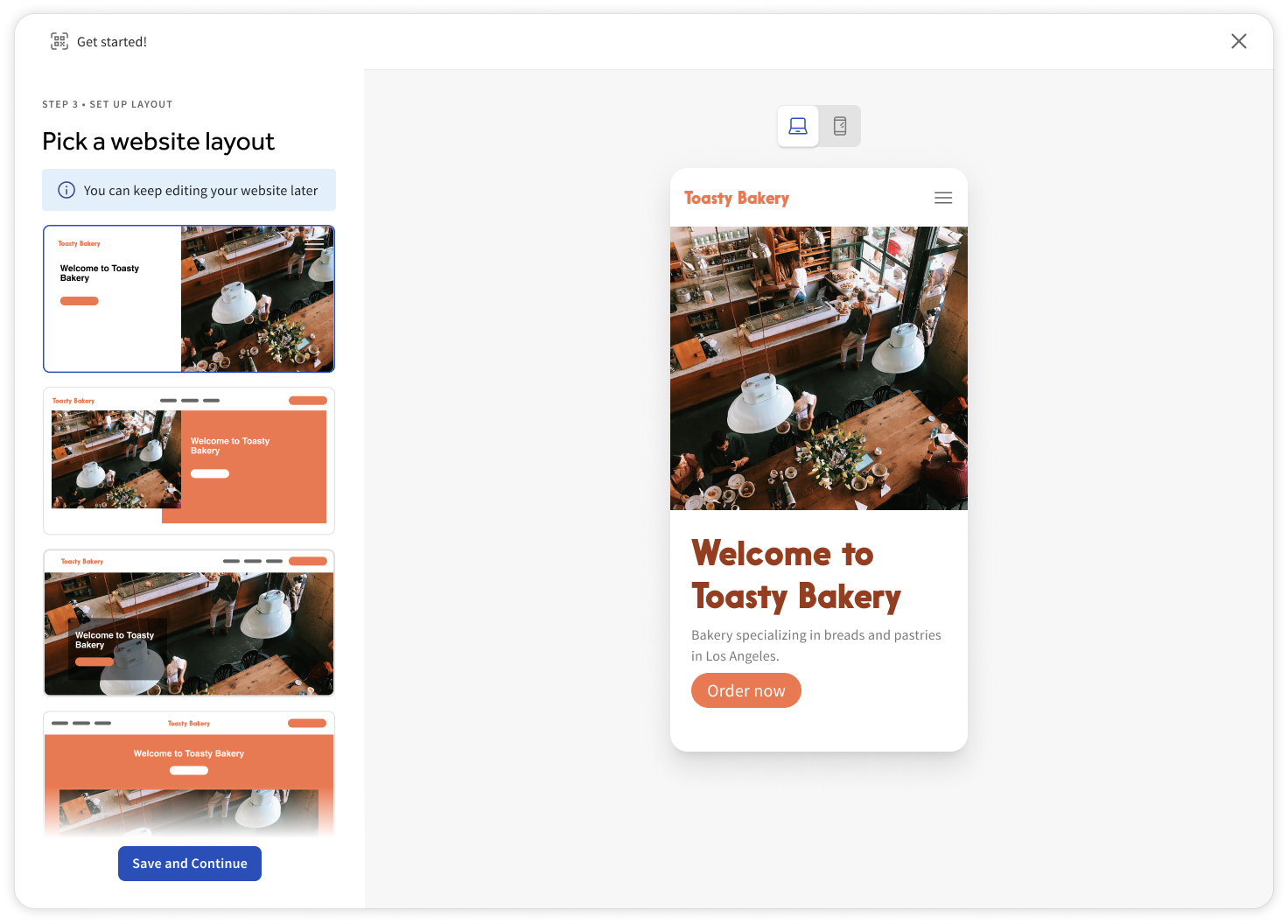
The existing onboarding process was fragmented across multiple experiences, each lacking cohesion and consistency. None of the flows provided previews or renders, leaving customers confused about what they were setting up and how it would align with their brand.
For this project, we analyzed over 100 support tickets from the past six months and found that 65% were tied to confusion during setup or incomplete onboarding tasks.
These insights, combined with customer interviews, highlighted key pain points like unclear branding configurations and insufficient guidance, shaping our approach to redesign the process.
The Research
To better understand the challenges users were facing, we conducted interviews with 10 customers who had experienced issues during the onboarding process. The interviews revealed recurring frustrations around the lack of visual clarity and guidance.
One customer shared, "I just want to see exactly what my site is going to look like as I set it up. I need previews and renders to feel confident in what I’m creating—otherwise, I’m just guessing."
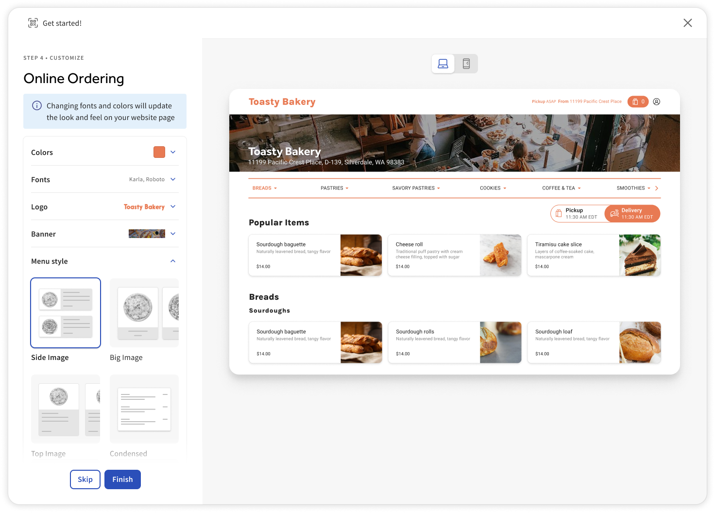
This insight reinforced the need for real-time previews and clearer direction throughout the process.
One customer shared, "I just want to see exactly what my site is going to look like as I set it up. I need previews and renders to feel confident in what I’m creating—otherwise, I’m just guessing."
This insight reinforced the need for real-time previews and clearer direction throughout the process.
Designing for Diverse Customer Needs: Speed VS Customization
As we began designing, we identified two distinct customer types: the rushed business owner who needs to set up their Digital Storefront products as quickly as possible, who may also not have branding assets on hand and the detail-oriented user who prefers a more thorough, customized setup.
This insight led us to create a flexible onboarding flow, balancing a fast-track option for efficiency with a comprehensive path for those seeking deeper customization.
This insight led us to create a flexible onboarding flow, balancing a fast-track option for efficiency with a comprehensive path for those seeking deeper customization.
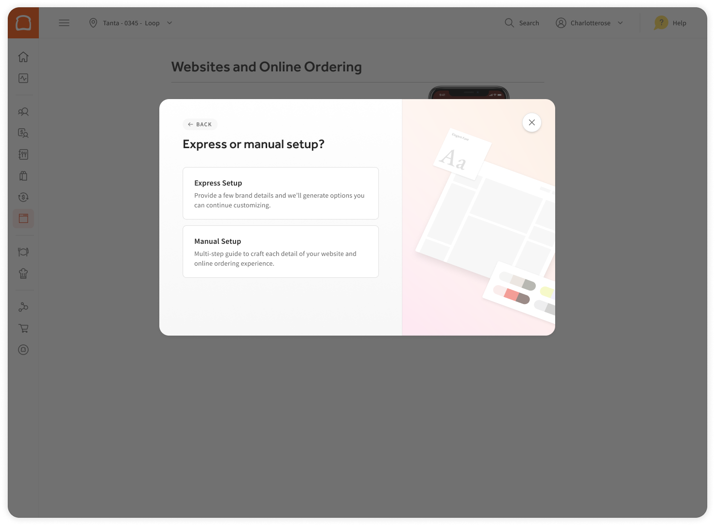
Two Tailored Paths: Express and Manual Setup
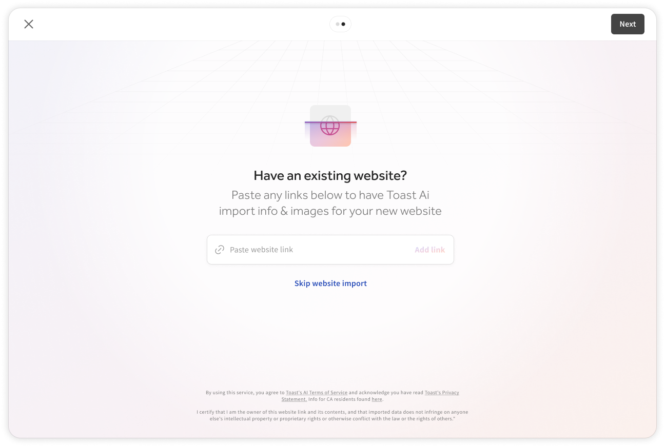
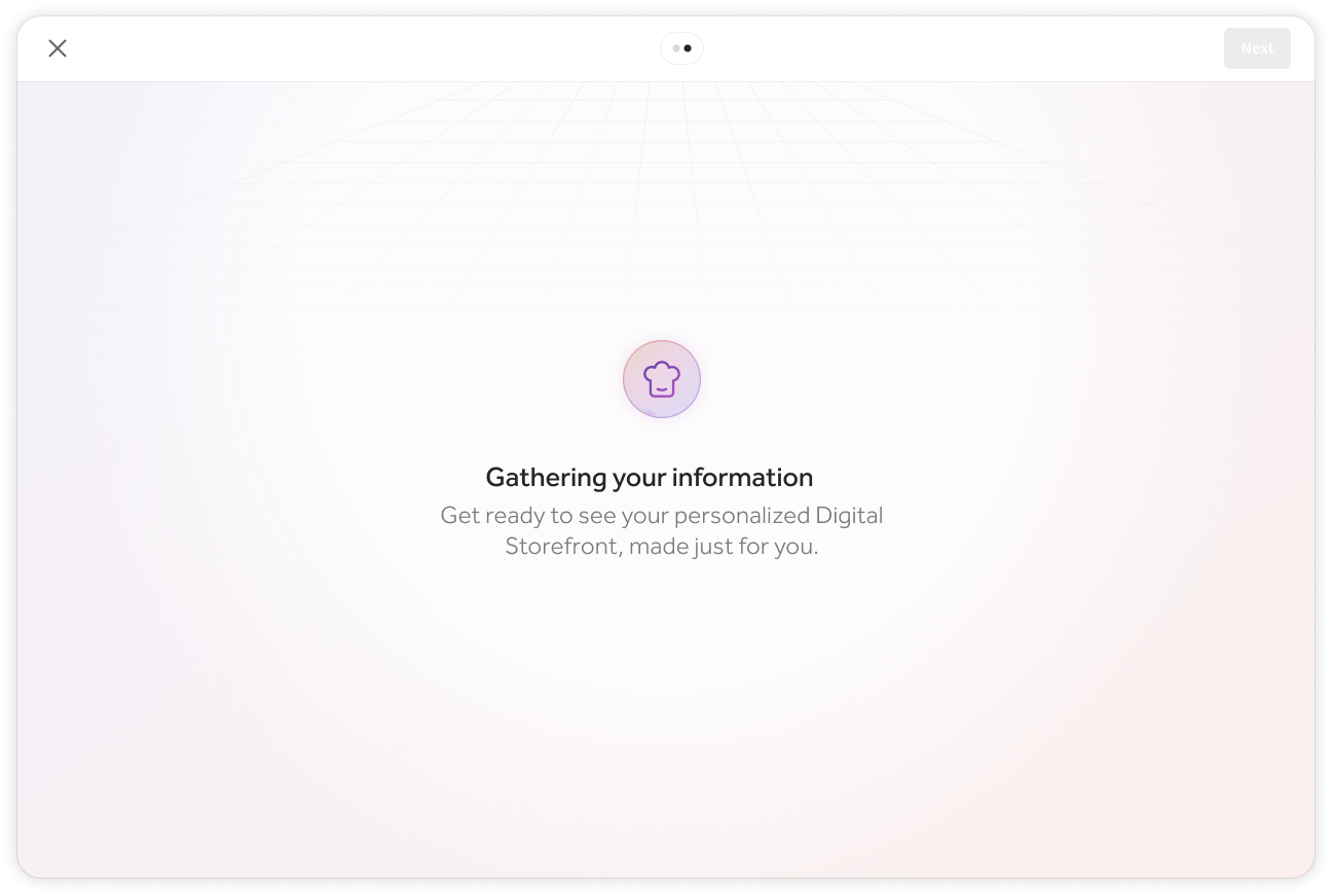
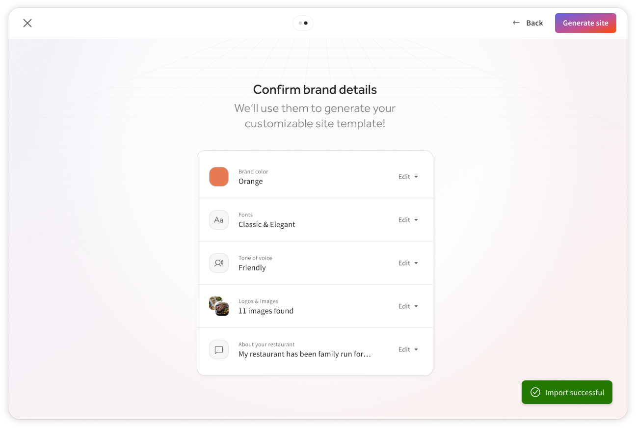
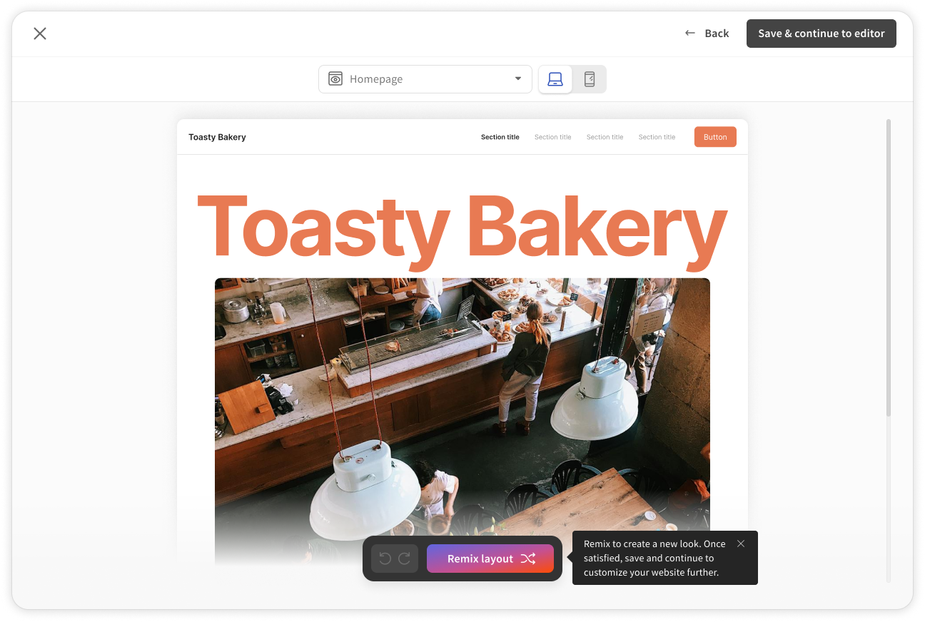
Express Setup: An AI-driven flow designed for speed, capable of generating a complete website and online ordering page in minutes. This path could scrape existing sites for images, generate a color palette from the customer’s logo, and set a tone of voice and typography with a couple of steps—delivering a polished site effortlessly.
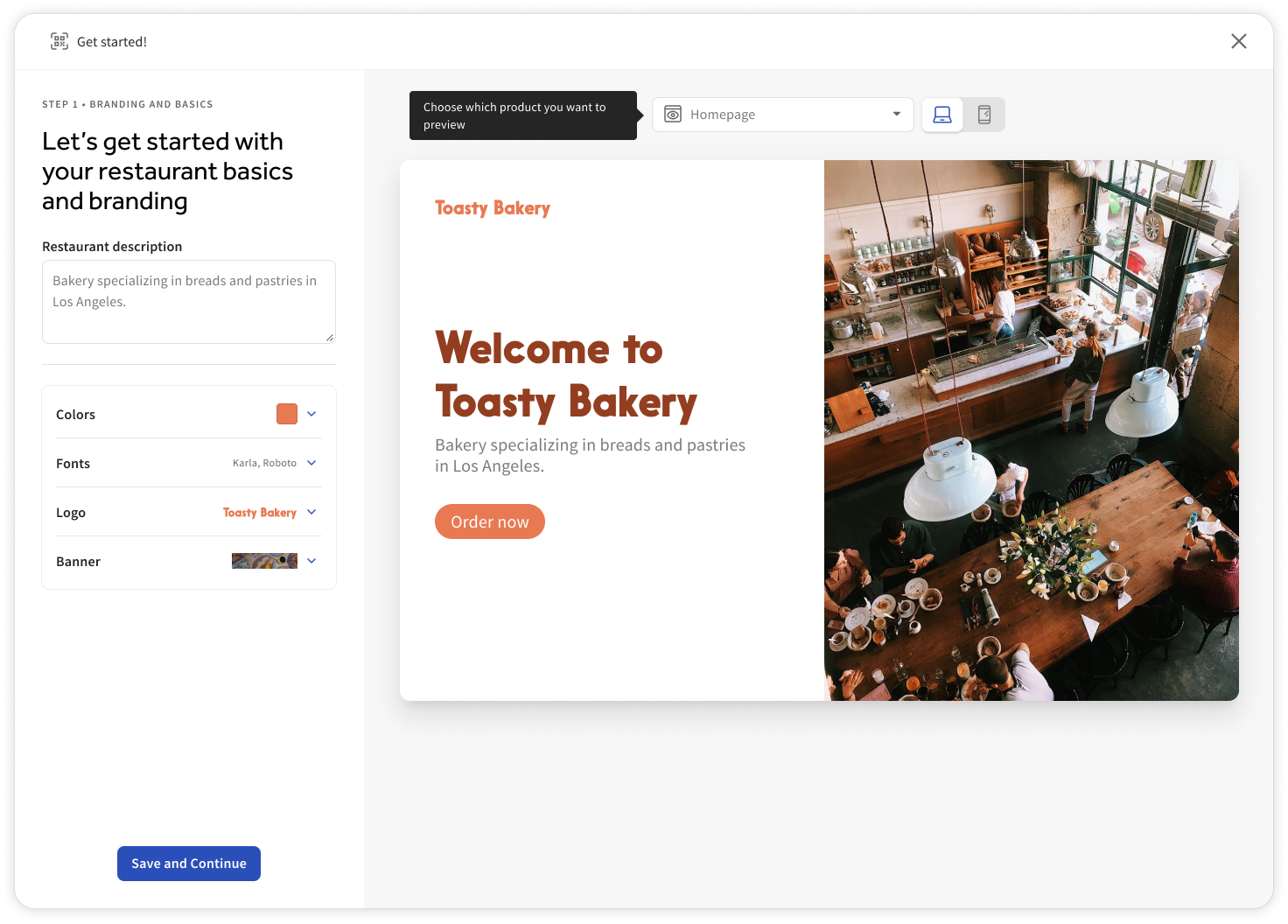
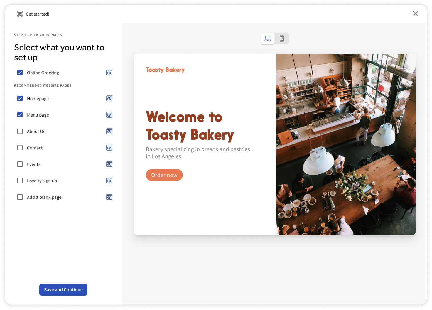
Manual Setup: A multi-step guide tailored for users who prefer to craft each detail of their website and online ordering experience, offering greater customization and control.
We decided to implement the Manual Setup path first due to technical limitations that made the more robust vision for the Express Setup path challenging to execute immediately. While the AI-driven, automated flow held immense potential, it required advanced scraping and generation capabilities that needed further development. Starting with the Manual Setup allowed us to deliver value quickly by offering a guided, customizable experience, which we also user-tested and were able to refine, while setting the stage for the future integration of the Express Setup path.
The Manual Setup
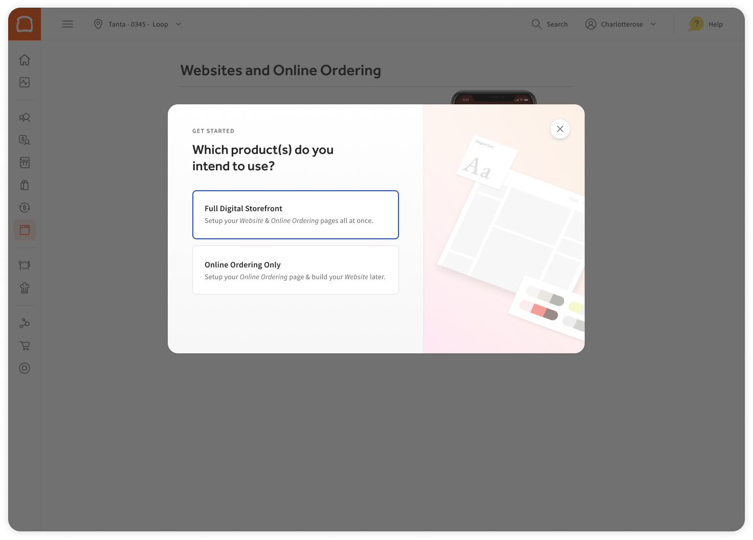
The onboarding flow starts with three key steps:
Get Started Screen: A quick overview of what customers can set up, providing clear expectations for the process.
Product Selection: Customers choose whether to set up the full Digital Storefront Suite or just Online Ordering, catering to those who already have a website.
Setup Path Choice: Customers then select between Manual Setup, for a detailed, step-by-step process, or Express Setup, for a fast, AI-generated solution

The Express Setup
Results:
As of October 2024, Improvements to the onboarding experience boosted customer retention from 50% to 82% by task completion rate, lowering 30% of care tickets YoY
Next steps:
As our product suite grows, we will also include a self-service onboarding for the branded app (currently in beta) in this flow in the future.
The success of this flow also sparked cross-functional conversations with other teams to unify the onboarding experience across all products that use branding customizations, such as the POS and in-store Kiosks
The success of this flow also sparked cross-functional conversations with other teams to unify the onboarding experience across all products that use branding customizations, such as the POS and in-store Kiosks